5.5 Integrating Performance Metric Charts and Gauges into a Drawing
Charts and gauges for performance metrics can be easily added to any drawing. They can be added via the Layout menu, or by applying them as a node style.
In order to use these features, Operations Center must be configured to capture historical performance data. For information on capturing performance metrics, see Capturing Alarm and Performance History
in the Operations Center 5.6 Server Configuration Guide.
Layout drawing charts and gauges:
-
Render performance metrics for the current element, another element, the parent or grandparent element, or a specified element or set of elements
-
Compare one or more metrics (up to five) using a bar, stacked bar, line, or pie charts.
-
Display information about a single metric series using various types of gauge displays.
-
Can use regular expressions or scripts (FormulaScript) matchers to select metrics.
-
(Charts) Must be configured for refresh interval, axis and grid values, and background color bands for acceptable condition (not available for Pie charts).
-
(Gauges) Must be configured for refresh interval, minimum/maximum expected values, and condition threshold definitions.
-
Provide various display options that allow you to toggle various information on and off inside the chart or gauge display.
-
Can use one element for display name and algorithm setting context, and a another element for metric/source data.
Add charts or gauges to the Layout drawing via the Layout menu, or by applying as a nodes style. For more information about node styles, see Section 6.0, Working with Node Styles and Custom Graphics.
The following sections describe how to add a chart to the Layout drawing and configure it:
5.5.1 Types of Charts
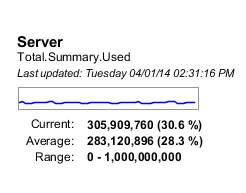
A series of charts are available to add to the Layout view drawing. All charts show information for one metric including current, average and range values; a trending line; and date/time of last update. Each chart is configurable with various options to hide or show any of this information. And, severity can be overlaid on the chart as background colors.
|
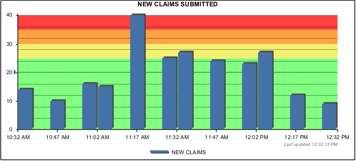
Bar The bar chart uses vertical columns to chart the values of one or more metric series. |
|
|
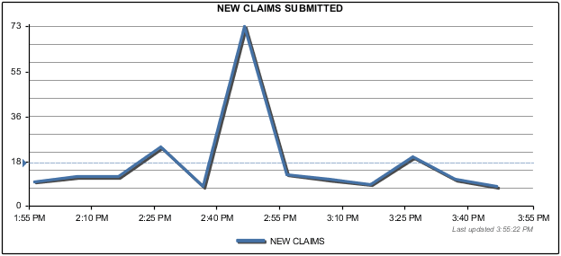
Line The line chart plots data points in one or more metric series. |
|
|
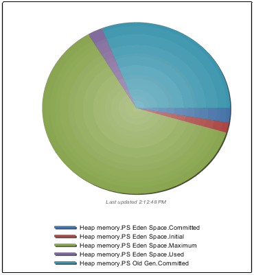
Pie The pie chart is divided into proportional sections based on metric values. Use the pie chart when you want to compare the size of each metric as a slice with the whole of the pie. |
|
|
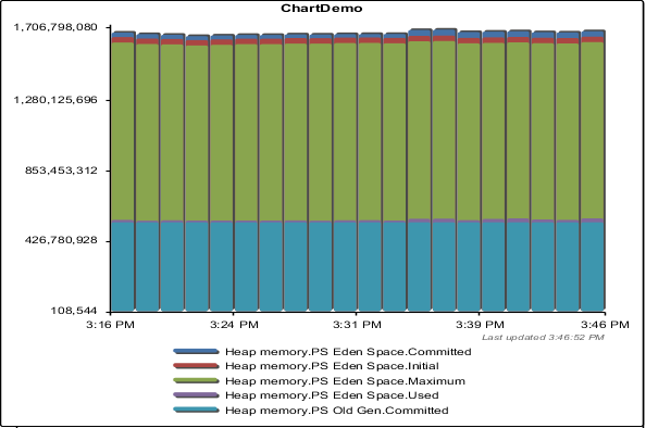
Stacked Bar The stacked bar chart compares the contribution of each metric to the total of all by using stacked columns. Use the stacked bar chart when you have multiple metrics and when you want to emphasize the total. |
|
5.5.2 Types of Gauges
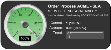
A series of gauges are available to add to the Layout view drawing. Gauges show information for one metric that can include current, average and range values; a sparkline; and date/time of last update. Each gauge is configurable with various options to hide or show any of this information. And, depending on the type of gauge, the current value is interpreted using a needle gauge, filled cylinder, progress bar, or lit LED bars.
|
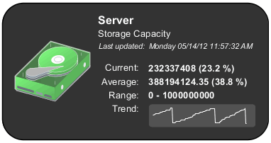
Basic Display The basic display gauge shows various information about a metric’s performance. Any graphic from the Operations Center > or > libraries can be included in the gauge display. The condition of the source element is used to updated the background color of attached graphic, when possible. |
|
|
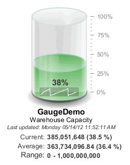
Cylinder The cylinder gauge interprets the current value of a metric as a volume in a three-dimensional cylinder. Based on gauge configurations, the metric value is evaluated for severity which updates the background color of the volume fill inside the cylinder. |
|
|
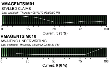
LED Bar The LED gauge interprets the current value of a metric to light up bars on an LED display. Based on gauge configurations, the metric value is evaluated for severity which updates the background color of the bars. |
|
|
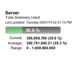
Percent Bar The Percent Bar gauge interprets the current value of a metric to fill out the progress bar. Based on gauge configurations, the metric value is evaluated for severity which updates the background color of the progress bar. |
|
|
Sparkline The Sparkline gauge shows a small trending line, called a sparkline, using the recent values of a specified metric. |
|
|
Speedometer The speedometer gauge interprets the current value of a metric and displays this “speed” on an analog-style needle. Based on gauge configurations, the metric value is evaluated for severity which updates the background color of the needle display. |
|
5.5.3 Adding Charts and Gauges
To watch a video tutorial on chart and gauge configuration in layout drawings, go to:
To add a chart or gauge to the Layout drawing:
-
In the drawing (Edit Mode), right-click the background, then select , then do one of the following:
-
To add a chart, go to > and select the chart type.
Select from options to add a bar, line, pie or stacked bar chart.
-
To add a gauge, go to > and select the gauge type.
Select from options to add a basic, cylinder, LED bar, percent bar, sparkline, or speedometer gauge.
The chart or gauge is added to the Layout drawing.
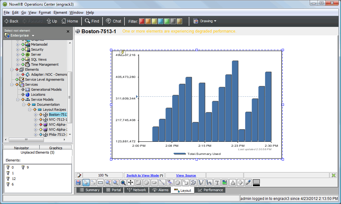
In the illustration above, we added a bar chart.
By default, charts are rendered showing the Operations Server metric, Total.Summary.Used, for a 30 minute interval. For these, as well as gauges, you must configure the source element and data properties (desired metric(s)) in Properties.
-
-
Continue Configuring Chart and Gauge Properties to customize the chart.
5.5.4 Configuring Chart and Gauge Properties
After a chart is added to the drawing, you can configure it. At a minimum, you must select the source element and define the metric(s) to chart.
Using Drag & Drop to Change Element Context
For some charts and gauges, you may want the context to be different from the natural element (the element currently selected in the Explorer pane). Setting a context association changes the defaults for chart/gauge titles as well as the context used when applying Source Element settings. For example, if the chart/gauge is looking for a metric from a parent element, the parent element of the context element is used to retrieve metric data. For information on Source Element settings, see Step 8.
To change the source element using drag & drop:
-
While maintaining focus of the Layout drawing chart/gauge, locate the new element in the Explorer pane.
-
Click the new element and drag it over onto the chart or gauge. A message displays, “Are you sure you want to change this drawing item to be bound to element ?”
-
Click .
The chart is now driven by the new element, it uses this element for the chart/gauge name as well as the context used for some Source Element settings.
Updating Chart and Gauge Properties
To configure a Layout drawing chart/gauge:
-
In the drawing (Edit Mode), right-click the chart or gauge, then select > .
The Properties dialog opens.
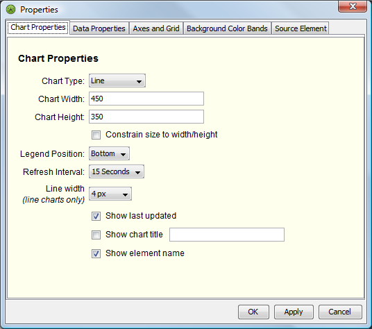
Properties tabs and options vary between the type of chart or gauge selected. The above illustration shows Chart Properties for Bar, Line and Stacked Bar charts.
By default, the chart or gauge is rendered using the Operations Center Server element, using the Total.Summary.Used metric, for last 30 minutes of data.
-
(Charts) In the tab, configure various display properties:
Chart Type: Select from , , , or .
IMPORTANT:After changing the chart type, click to save the change and exit the Properties dialog. Then, reopen to configure properties specific to the new chart type.
Chart Width: Specify the width of the chart, in pixels.
Chart Height: Specify the height of the chart, in pixels.
Select to enforce chart dimensions in the Operations Center Dashboard. Use this option to keep charts uniform in size when there is more than one chart included in a view. Padding is adjusted from the inner chart, as needed, to keep the chart consistent with the size dimensions.
Legend Position: Specify the visibility and location of the legend. Select to hide the legend. Select from , , or to indicate where to show the legend.
Refresh Interval: Specify the amount of time between reload of chart data.
Line Width: (Line charts only) Specify the width of the chart line, in pixels.
As appropriate, select from the following check box options:
-
Select to show the date/time that the last update was received.
-
Select to show a title for the chart. Type the desired text in the field provided.
-
Select to show the element’s name in the chart title. If a title is specified in the option above, element name shows as a subtitle under the title.
-
-
(Pie Charts) In the tab, configure various display properties:
Gradient: Select from or to adjust the rendering of color in the pie chart slices.
Shadow Width: Use the drop-down to specify the thickness for the pie chart’s shadow.
Sort Order: Specify the order in which to show slices inside the pie chart. Select from , , , or .
Legend Format: Specify possible additional information to display in the legend beside the metric name. Select from , , or .
-
(Gauges) In the tab, configure various display properties:
Gauge Title: Specify a title to show in the top of the gauge display.
Last Update: Specify the syntax to display the date and time of last update. Use the Java SimpleDateFormat to specify date format, and wrap informational text in apostrophes.
For example, the default 'Last updated: ' EEEE MM/dd/yy hh:mm:ss a outputs the following: Last updated: Tuesday, 07/10/12 12:15:05 PM.
Minimum (Expected): Specify the lowest valid value you expect the metric to be. This value is used when performing threshold evaluations.
Maximum (Expected): Specify the highest valid value you expect the metric to be. This value is used when performing threshold evaluations.
Refresh Interval: Specify, in seconds, the amount of time between reload of gauge data.
Condition Thresholds: (Non-Basic Gauges Only) Select from the following options to specify how the condition applies when evaluating the gauge value against threshold limits:
-
Condition applies when gauge is equal or greater than threshold: Select this option to trigger the condition level when the gauge value is equal or greater than the threshold value.
-
Condition applies when gauge is less than threshold: Select this option to trigger the condition level when the gauge is less than the threshold value.
Then, specify the percentage value for each threshold state. Threshold evaluations are calculated using the expected minimum and maximum values above. If the actual value is above the maximum expected value, the condition shows as the most severe condition level. If the condition is less than the minimum expected value, the condition shows as the least severe condition level.
Display Options: Select any of the following check box options to hide or show various information in the gauge display.
-
Show element name: Deselect this option to hide the element name.
-
Show average value: Deselect this option to hide the average metric value.
-
Show sparkline: Deselect this option to hide the trending line.
-
Show range: Deselect this option to hide the expected minimum and maximum values.
-
Show actual/current value: Deselect this option to hide the current metric value.
-
Show metric name: Deselect this option to hide the metric name, or Gauge Title value if specified.
-
Show last update: Deselect this option to hide the last date and time the data was last refreshed.
-
-
In the tab, define the performance metric to chart or drive the gauge and specify time range options.
If a performance metric is not available, Operations Center looks for a matching element property instead.
NOTE:Element properties cannot show historical data. If an element property is used to create a line chart, the chart will have only a single point for the element property. To create a line chart with historical values, you must add a performance series for the element property.
Under, specify the range of time to chart by entering a number and selecting from , or ,
If charting availability metrics, specify a calendar to apply in the drop-down list. Undefined time periods in the calendar are treated as blackout times and are not count against the element.
Under, specify the metric(s) to chart by selecting one of the following options:
-
Single Metric: Charts the one metric as explicitly defined.
Specify the name of the metric in the field, then specify text to show for the metric’s line in the field.
-
Specify Regular Expression Metric Matcher: Charts up to five metrics using a regular expression.
Specify a regular expression to match in the field.
Even if the regular expression finds more than 5 matching metrics, the chart only shows the first 5 found.
-
Specify Script: Charts up to five metrics by running the specified script.
Edit the script example or enter valid NOC Script to capture the desired metrics.
The script must be written using NOC Script. For more information, see the Operations Center 5.6 Scripting Guide. For information about available objects, see Section B.8, Script Objects
For gauges, Even if the script finds more than 5 matching metrics, the chart only shows the first 5 found.
-
-
(Line, Bar and Stacked Bar Charts) In the tab, configure properties related to the chart’s axis and grid lines.
Chart Minimum Value: Enter the smallest value to show on the chart Y axis. Enter numeric values only without separators. If not specified, the chart’s axis adjusts to show the full range of values. If specified and more data exists, the metric line will cap and shows as a flat line.
Chart Maximum Value: Enter the largest value to show on the chart Y axis. Enter numbers only without separators. If not specified, the chart’s axis adjusts to show the full range of values. If specified and more data exists, the metric line will cap and shows as a flat line.
As appropriate, select from the following check box options:
-
Select to chart a line for the average of each metric.
-
Select to show chart lines styled with a shadow.
-
Select to show grid lines running vertically.
-
Select to show grid lines running horizontally.
-
-
(Line, Bar and Stacked Bar Charts) In the tab, configure conditional banding based on severity ranges.
Select the check box for each severity to show banded in the chart background. For each selected, specify the and values, using numeric values only without separators.
-
In the tab, specify the relative element that supplies metric(s) data.
Self: Uses the natural element (current element selected in the Explorer pane), or the context element if one is applied. For more information on context elements, see Using Drag & Drop to Change Element Context.
Parent Element: Uses the parent of the natural or context element.
Grandparent Element: Uses the grandparent of the natural or context element.
Specify DName: Uses a specified element. Enter the full DName of the desired element.
Specify Custom DName With Script: Matches an element based on the script provided. Enter valid NOC Script code. For more information, see the Operations Center 5.6 Scripting Guide. For information about available objects, see Section B.8, Script Objects
-
(Basic Gauge) In the tab, specify an optional graphic to show in the gauge. The graphic defined must reside in the or libraries.
In the field, specify the path to the graphic using double-underscore "__" characters to separate folder and graphic names. Do not include the Graphics folder in the path.
For example, to reference Graphics > Clipart > People > person, specify the as: Clipart__People__person.
Special characters must be encoded. Use the steps below to capture the exact path location for the clipart or graphic file. If no graphic is specified or cannot be located, and the option is enabled, the gradient bubble nodestyle is displayed for the source element. To hide the graphic, unselect the check box.
To obtain the graphic location path, do the following:
-
Exit the gauge Properties dialog.
-
In the Explorer pane, located the desired graphic in or .
-
Right-click the graphic name, and select .
The graphic location is copied to the clipboard.
-
Reopen the gauge Properties dialog, switch to the Graphic tab, and paste the location into the field.
-
-
Click at any time to apply the changes. The chart updates.
-
Click to save changes and close the Properties dialog.