8.4 Configuring the Information Portlet
The Information portlet provides a summarized view of an element’s status. It might also include a graphical display of the element’s layout view and/or an alarms chart.
Based on its settings, the portal can also allow navigation down to any children or up to the parent’s view and displays the current condition and status. Various information is available via tab views including element properties, alarms, layout, root cause, impacted elements, charts, jobs (NetIQ AppManager only), and custom properties (NetIQ AppManager only).
In the tab, as in the Operations Center console, alarm operations can be performed (when available), alarm filters can be created and applied, and alarm data can be exported to an Excel or PDF file.
In the tab, as in the Operations Center console’s Performance view, view a chart of performance and service level metrics. A preview slider bar allows you to see data trending and easily adjust the selected range. When a metric exceeds the maximum number of data points that can be charted at one time, Operations Center automatically generates the best representation of the data as possible, either by summarizing when data points are numeric values or clipping the data. In either case, you can narrow the chart range to display additional data.
All options are configurable to create a custom display.
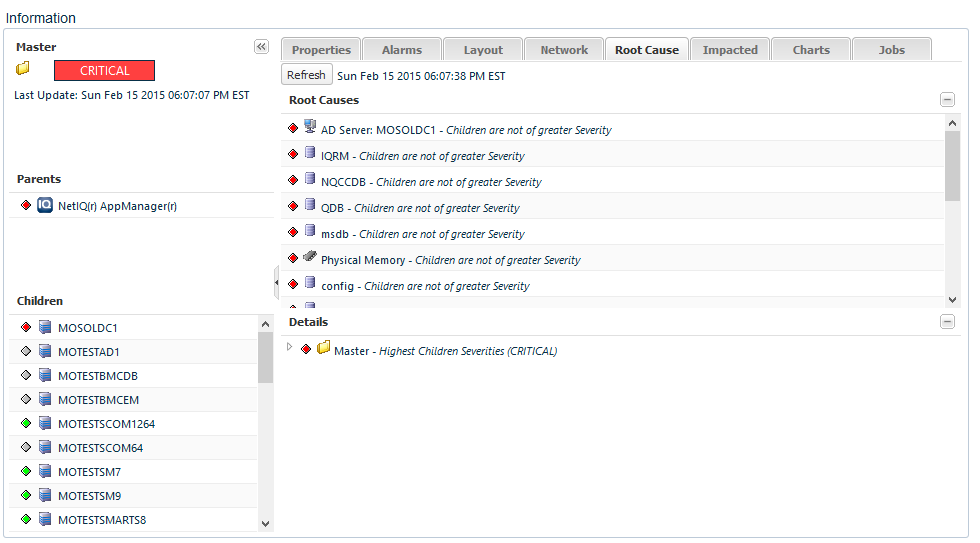
Figure 8-4 Information Portlet
The Information portlet is optimized to display at a resolution of 1280 (or greater) in width, and inside a column layout that expands to 50% or greater. For smaller configurations, scroll bars will be implemented on components, such as performance charts.
The Information Portlet can also be used to set the starting element for other portlets on the Web page, similar to the Navigation portlet. To configure the Information portlet to drive other portlets using Navigation, see Step 3 and Section 7.4, Using Navigation Mode to Drive Multiple Portlets.
The following sections provide detailed information about the Information portlet:
8.4.1 Viewing Element Information
The actual information shown in the portlet/view depend on various settings in the configuration options:
-
Element Status: Displays the condition of the element with date/time of last update.
-
Parents/Children: Displays simple lists of both parents and children. Click an element name to update the Information portlet for that element.
-
Information Tabs: View element properties, alarms, alarm summary information, layout/relationship diagrams, network, root cause, and impacted elements; as well as chart any available performance metrics. In addition, view custom properties and jobs (for AppManager elements only).
NOTE:Data in the tab displays based on the time zone of the Operations Center server, and not the time zone configured for the Dashboard.
To view element information:
-
Do any of the following:
-
Click the arrow button to close the left panel, expanding viewing area for information in tabs. Click the arrow button again to open the left panel.
-
Click a parent or child element to update the portlet information and navigate through the element hierarchy.
-
Click any of the tabs to view additional information about the current element.
-
In the , , , and tabs, click the button to force an update of the information.
-
-
In the tab, do any of the following:
-
Click the metrics selected link to add or remove metrics from the chart.
-
Select a smaller charting range when data is summarized or incomplete. Use the preview slider bar to zoom in, click any of the range buttons, or select new dates and times from the date range.
When a request exceeds the maximum number of data points can be charted at one time, Operations Center generates an automatic representation of existing data and trending. When information can be summarized (for example, when values are numbers and not element conditions), the chart uses averaged data points from the original data and displays a message that there is summarized data. If the data cannot be averaged, metric data is clipped to the maximum number of points possible and the chart displays a message that there is incomplete data.
-
Click any metric name in the legend to hide it from the chart.
-
Click the
 icon and select to view a list of values for all data points currently showing in the chart. Any hidden metrics are excluded.
-
-
In the tab, do any of the following to configure the diagram:
-
Click severity filter boxes to toggle elements in/out of the diagram by state.
-
Select the number of levels of children to show in the diagram.
-
Select the type of diagram.
-
Click the
icon and select to reset the diagram.
-
-
In the tab, view a list of jobs for the machine(s). Double-click a job to view settings and details about the job, even add a comment. For more information, see
AppManager Operations Portal Features for Viewing NetIQ AppManager Jobs
in the NetIQ AppManager Operations 5.5 Portal Getting Started Guide. -
AppManager Only In the tab, view a list of custom properties for the machine(s) or logical servers. If you have manage permissions, you can edit the custom properties and apply the changes to AppManager.
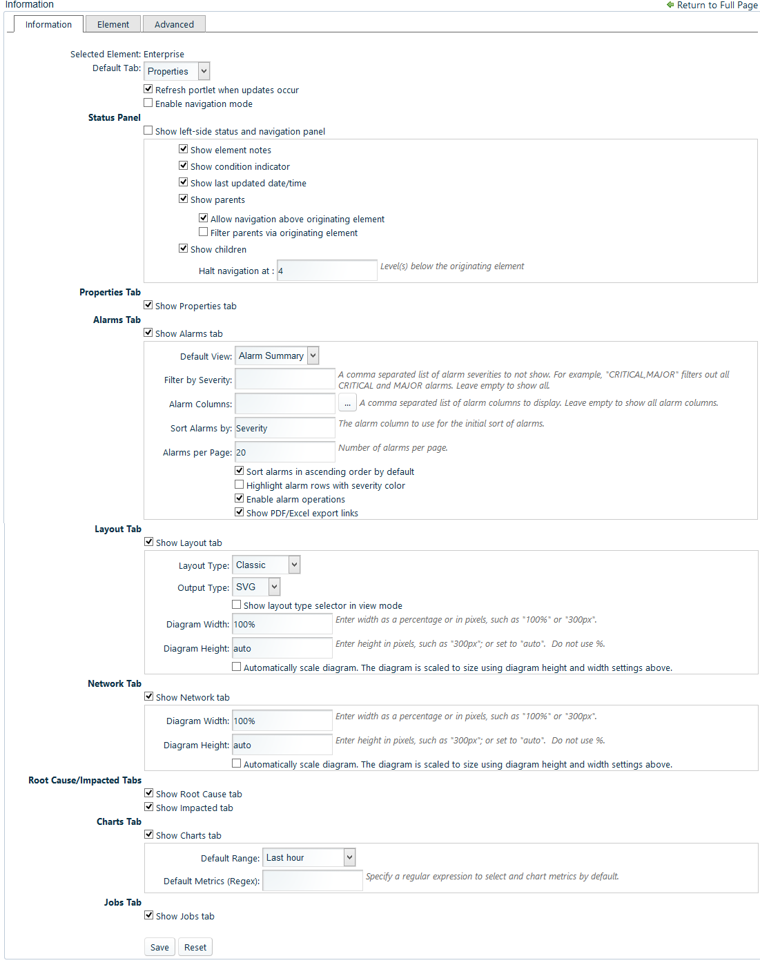
8.4.2 Configuring the Information Portlet
To configure preferences for the Information portlet:
-
Click
 and select
  and update settings on the tab:
-
To change the default view for the portlet, select a new tab name from the drop-down list.
-
Deselect the option to manually control updates. When selected, enables the Dashboard to receive automatic updates from the Operations Center server as content changes occur. Note that the Alarm portlet does not support push updates for SLA alarms.
-
Deselect the to disable the portlet from updating other portlets on the page when an element is selected in the Information portlet.
When Navigation mode is enabled, the Information portlet functions as a driver for the content displayed in other portlets except for the Navigation portlet. Selecting an element in the Information portlet displays information about the element in other portlets on the page. This feature is only available when using SVG on IE, and is not supported on Firefox. For more information about setting up portlets to be driven by other portlets, see Section 7.4, Using Navigation Mode to Drive Multiple Portlets.
-
Under , select or deselect the following options for the left-side status and navigation panel:
Show left-side status and navigation panel: Unselected by default. Select to show the left panel with status information and parent/children navigation lists.
Show element notes: Selected by default. Deselect to hide element notes in the header.
Show condition indicator: Selected by default. Deselect to hide the element’s condition indicator in the status panel.
Show last updated date/time: Selected by default. Deselect to hide the date and time of the last update.
Show parents: Selected by default. Deselect to hide the list of parent elements.
Then, select or deselect the following check box options for parents:
-
Allow navigation above originating element: Selected by default. Deselect to restrict upward navigation to the selected element in portal preferences.
-
Filter parents via originating element: Selected by default. Shows the parent element whose DName partially matches the selected element; this is the parent where the selected element was originally created in the Operations Center hierarchy. Deselect the option to show all parents -- this includes any parents under Service Models where the element is linked.
For example, if the selected element is from a NetIQ AppManager adapter, and is also linked from three Service Model elements, we would see only one parent listed (the parent element in the NetIQ adapter hierarchy) when this option is selected. We would see a total of four parents listed (the parent in the NetIQ adapter hierarchy, plus the three parents in the Service Model hierarchy) when this option is unselected.
Show children: Selected by default. Deselect to hide the list of children elements.
Then, specify the following options for children:
-
Halt navigation: Specify the number of levels of children that are available for navigation under the selected element in portal preferences.
-
-
Under , select or deselect the following options for element properties:
Show Properties tab: Selected by default. Deselect to hide the tab.
-
Under , select or deselect the following check box options for custom properties:
Show Custom Properties tab: Selected by default. Deselect to hide the tab.
-
Under , Select or deselect the following options for alarms:
Show Alarms tab: Selected by default. Deselect to hide the tab.
Default View: Specify the type of alarm information to show. Select between and .
Filter by Severity: Specify a comma separated list of severities (such as “CRITICAL,MINOR”) to hide alarms with specific severity levels. Alarms with matching severities will not show in the information portlet. Leave this field empty to show all alarms. In addition to this option, you can also filter alarms by severity using the colored bar when viewing the alarms.
Alarm Columns: Specify a comma separated list of alarm columns to display (and hide all other columns). Leave blank to display all columns. Columns available to display are dependent on the source of the alarms.
If alarms are currently displayed in the portlet, click the browse (...) button to select columns from a list based on a sampling from the current alarms. If no alarms are currently displayed in the portlet, the selector is unable to show columns to select from. Use the left and right arrow buttons to move a column name between the Available list and the Selected list. Use the up and down arrows to reorder column names.
Sort Alarms by: Specify a column name to use as a sort key for displayed alarms. Severity is the default sort key. You can also change the sort key while viewing the alarms table by clicking a column heading.
Alarms per Page: Specify the maximum number of alarms to show on each page.
Then, select or deselect the following check box options for alarms:
Sort alarms in ascending order by default: Selected by default. Deselect to initially sort in descending order. Use this option or click column headings when viewing the table to change the sort order.
Highlight alarm rows with severity color: Not selected by default; only the alarm severity column is shaded in each row. When selected, shades the entire row the same color as the severity.
Enable alarm operations: Selected by default. Enables alarm operations to be performed in the Dashboard as they are on the Operations Center console. Deselect to prevent users from performing alarm operations.
Show PDF/Excel export links: Selected by default; allows exporting alarms. Deselect to remove the PDF and Excel options.
-
Under , select or deselect the following options for layout diagrams:
Show Layout tab: Selected by default. Deselect to hide the Layout tab.
Then, specify the following options for the layout diagram:
-
Layout Type: Specify the type of layout to display. Select between and .
-
Output Type: Specify the type of technology used to display the diagram. Select between and .
-
Show layout type selector in view mode: Selected by default to allow the user to toggle between layout types in view mode.
-
Diagram Width: Determines the size of the diagram within the portlet and is expressed as a percentage. The default is 100%.
-
Diagram Height: Determines the height of the diagram within the portlet and is expressed as pixels. The default is auto.
-
Automatically scale diagram: Select this option to resize the diagram to fit it inside the specified and . When this option is selected and is set to auto, the diagram fills the horizontal space, and then expands vertically as needed. If the is set to a fixed size, the diagram reduces in size until it fits in the space. Deselect this option to render the diagram without resizing; scroll bars are added as needed to view the diagram.
-
-
Under , select or deselect the following options for the network display of elements:
Show Network tab: Selected by default. Deselect to hide the tab.
Then, specify the following options for the layout diagram:
-
Diagram Width: Determines the size of the diagram within the portlet and is expressed as a percentage. The default is 100%.
-
Diagram Height: Determines the height of the diagram within the portlet and is expressed as pixels. The default is auto.
-
Automatically scale diagram: Select this option to resize the diagram to fit it inside the specified and . When this option is selected and is set to auto, the diagram fills the horizontal space, and then expands vertically as needed. If the is set to a fixed size, the diagram reduces in size until it fits in the space. Deselect this option to render the diagram without resizing; scroll bars are added as needed to view the diagram.
-
-
Under , select or deselect the following options for root cause and impacted elements:
Show Root Cause tab: Selected by default. Deselect to hide the tab.
Show Impacted tab: Selected by default. Deselect to hide the tab.
-
Under , select or deselect the following check box options for charts:
Show Charts tab: Selected by default. Deselect to hide the tab.
Then, specify the following options for the chart:
-
Default Range: Select the length of time shown in the chart when it initially loads.
-
Default Metrics: Specify a regular expression to select and chart performance metrics to chart by default. If specified, the Information portlet attempts to find and charts metrics based on the regular expression. If no matching metrics are found for the selected element, you can manually select metrics applicable to that element. If matching metrics are found, the chart renders the first 10 metrics found. The chart can then be edited to change the selected metrics.
-
-
Under , select or deselect the following check box options for jobs:
Show Jobs tab: Selected by default. Deselect to hide the tab.
-
Click .