2.1 Accessing the Layout View and Custom Drawings
2.1.1 Understanding the Layout View
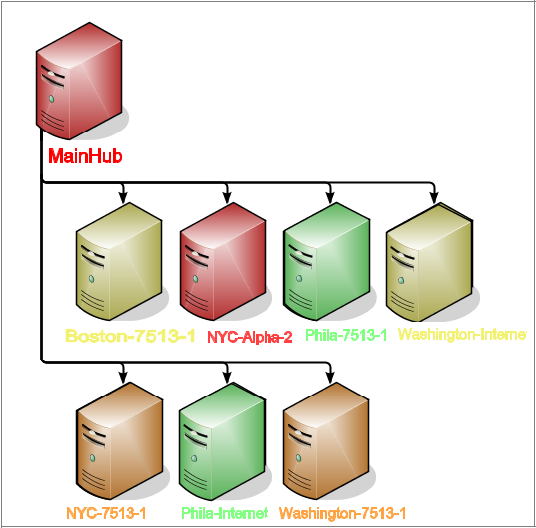
By default, the Layout view shows the selected element and its first-level children using a Gradient Bubble node style where fill color corresponds to the element’s current condition. Red means CRITICAL, orange means MAJOR, and so on. Arrows between elements show the relationships between parent and children. This is illustrated in Figure 2-1:
Figure 2-1 Default Layout View Drawing

In some cases, your System Administrator might have customized an element’s layout by stylizing the node style; or, adding graphics to create a custom drawing in order to help users better understand the organization of elements in an infrastructure.
The following are examples of how the default Layout view can be transformed into attractive, useful and informative drawings:
Geographic Maps
An imported map can be overlaid with circles or other shapes to represent the current network performance in each country. Location shapes are linked to element condition color. Or maps can be used in many creative ways such as linking and updating the relevant portion of the map to show system status, as illustrated in Figure 2-2:
Figure 2-2 Geographic Map

Business Processes
Imported graphics represent various elements in a business process. The shapes beneath the graphics are linked to element condition colors. For example, the element is red, representing the CRITICAL condition. The Layout view drawing tools were used to add text labels, arrows, and basic background shapes using gradient colors. This is illustrated in Figure 2-3:
Figure 2-3 Business Processes

Customized Node Style
Customized node styles illustrate the status of a network configuration management application. The computer graphic node style illustrated in Figure 2-4 uses fill color to show current server condition and identify sites experiencing critical problems. Server names use bound text to also show server condition. The drawing shows mapping and visualization of configuration items that enables peer-to-peer and hierarchical views. It also avoids duplicates and enables matching of configuration items from different sources.
Figure 2-4 Customized Node Style
The SVG graphics help users visualize critical relationships among elements in different areas of the element hierarchy.
2.1.2 Viewing a Layout Drawing
Typically, system users do not have the authority to modify Layout view drawings. In some cases, the Layout view can be disabled and not be available to users who are not members of the administrators group. For more information, see Access Control in the Operations Center 5.0 Security Management Guide.
To view a Layout drawing for an element:
-
In the pane, select the element to associate with the Layout view drawing.
You can select any element in any hierarchy.
-
Click the tab.
The view updates to show a drawing if available.
If no drawing has been created, the default automatic layout displays.
If the view is empty, a new drawing was created without any graphics. For instructions to re‑create the default layout, see Section 2.7, Reverting to a Previous Drawing or Default Layout.
Or, it is possible the drawing channel is set to Element Graphic when none has been created. For more information, see Section 6.6, Associating Custom Graphics with Classes and Elements.
The Layout view is read-only when indicated by a lock icon in the bottom left of the view. In read-only mode, you can navigate the view, zoom into different areas, and drill down to view linked elements.