8.7 Configuring a Performance Portlet
The Performance portlet can create line or bar charts that graphically measure:
-
SLA Compliance: view SLA data charts to determine if the objectives of a Service Level Agreement are being met.
-
Element Performance Metrics: shows element performance or alarm data over time.
-
Availability: shows element availability (not in a CRITICAL state) during a period of time.
-
Downtime: shows element downtime (in a CRITICAL state) during a period of time.
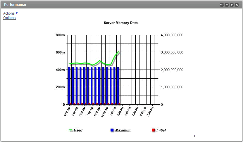
The following bar chart shows the availability for a selected element:
Figure 8-8 Performance Chart
For some types of elements, clicking on a specific data point opens a dialog showing more information about the data point in that series. Currently, this is only available for NetIQ AppManager elements and when specific configurations are enabled:
-
The chart display format is FLASH. Data point details are not available for JPEG or PNG outputs.
-
The chart type is line. Data point details are not available for bar charts.
-
The option is enabled.
When charting raw data, increase performance by reducing the number of data points returned while preserving the natural shape of the line. For more information about configuring this custom setting, see Section 7.8.2, Configuring Performance Data Point Retrieval from the Operations Center Server.
The Performance portlet is also available as a view from other Operations Center portlets including Alarms, Summary, Layout, Tree Map, Element Properties, Properties Table, Show Impacted, Root Cause, Chart Builder and Summary. Click and select > from any of these portlets.
To view and define the Performance portlet:
8.7.1 Viewing a Performance Chart
While viewing the Performance chart, do the following:
-
Click to select another metric, adjust the chart interval or range, or change the portlet size:
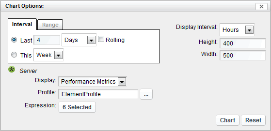
Enable the link by selecting in the portlet configuration preferences.
Any changes made using the link apply to the chart for the duration of the session and requires the user to manually adjust the settings to return to chart defaults during that session.
For additional information on specifying chart metric settings, see Section 8.7.2, Configuring the Performance Portlet.
-
Click the link located in the lower right to view the data used to render the chart.
For more information about viewing source data, see Section 7.7, Viewing Source Data for Charts.
8.7.2 Configuring the Performance Portlet
To configure the performance portlet:
-
Click
 and select
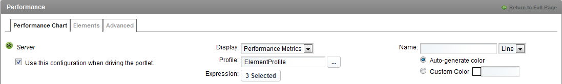
  . Begin defining the Performance component by selecting one or more starting elements.
The current starting element(s) display in the top of the tab.
To change or add elements, use the tab.
For more information, see Section 7.3.2, Configuring Starting Elements for Portlets.
-
Do the following for each element selected:
-
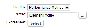
If charting performance metrics, select Performance Metrics in the drop-down list.
Performance metrics are based on user-defined profiles that collect performance and alarm data for selected elements. When a profile is defined, expressions are added to select which element properties are stored. For example, an expression can save the total number of alarms by severity for selected elements.
When the Performance Metrics chart type is selected, you must specify a profile and associated expression, which together determine the chart content.
IMPORTANT:When selected element or metric identifiers are not always predictable, it is best to use a regular expression to match profile expressions. For example, when the portlet is driven by another portlet, the selected element will not be fully predictable and a regular expression can match a number of predicted expressions for the element.
Or, if the selected profile captures metrics against a correlated service model created by an SCM definition, regular expressions are necessary to match a number of predicted expressions because expression identifiers for correlated metrics are renamed during the Operations Center server restart process or if the correlated service model element is renamed. Correlated metrics are easily recognizable by their naming convention of Correlated Element_Name: Unique_Identifier.
Then, to configure the Performance Metrics chart:
-
To select a profile, click the
 browse button.
Click to select the desired profile from the list.
-
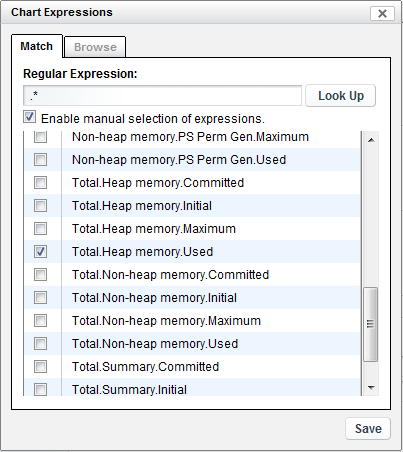
To specify a profile expression, click . The Chart Expressions dialog opens.
Do one of the following:
-
Match profile expressions by regular expression: Enter the regular expression to match in the field. A preview of matching expressions displays in the panel below.
For example, instead of specifying Heap memory.PS Eden Space.Committed as the expression for the Server element; using a regular expression, we could define any of the following:
[ABCH]eap.* Match any expression that has A,B,C or H in the beginning of the word.
.*Heap.* Match any expression that has "Heap" in its name.
^Heap.* Match any expression that begins with Heap.
\Deap.* Match any expression that begins with a non-digit and then has "eap".
[^abc]eap.* Match any expression with any character except a, b or c before "eap".
Regular expressions must conform to the Java standard regexes. For more information, go to the Java API for java.util.regex.Pattern.
Click to view a list of useful regular expressions if your Administrator has configured this. For more information about configuring the regular expression Look Up feature, see Section 7.8.3, Configuring Regular Expression Look Up for the Performance Portlet.
-
Select specific profile expressions from a list determined from a regular expression: Do the above, then select the check box. Click to select any expressions that you wish to chart.
Do not use this option when element or metric identifiers are not always predictable -- for example, when charting correlated metrics. Instead, match using a regular expression.
-
Select specific profile expressions from a list of all available profile expressions: Switch to the tab, then click to select each expression that you wish to chart.
Do not use this option when element or metric identifiers are not always predictable -- for example, when charting correlated metrics. Instead, match using a regular expression.
Click to close the Chart Expressions dialog. The Expression’s Select button updates to show the type of expression settings defined. For example, if you define a regular expression, the button label is . Hover over the button to see details.
For more information about profiles and expressions, and instructions on defining them, see Capturing Alarm and Performance History in the Novell Operations Center 5.0 Server Configuration Guide.
-
-
-
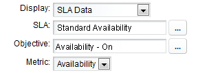
If charting Service Level Agreement metrics, select SLA Data in the drop-down list.
SLA data charts show if the objectives of a Service Level Agreement are being met.
Then, to configure the SLA Data chart:
-
To select a Service Level Agreement, click the SLA
browse button. Click to select the desired agreement from the list.
-
To select an Objective, click the Objective
browse button.
Click to select the desired agreement from the list.
-
Select the type of metric from the drop-down list. Options are:
-
Availability: The amount of time that a service is operational.
-
Breaches: Breach alarms are issued for an SLA when an objective is out of compliance (fails). The defined health rules determine when an SLA is in violation.
-
Condition: Tracks element conditions over time.
-
Health: Health grades assigned to an SLA based on the health of each objective. Operations Center uses health as a measurement for whether the SLA is in or out of compliance.
-
Outages: Incidents that result in key services, such as data or call centers, becoming unavailable (going offline). An outage occurs when an element reaches or goes below a specified condition.
-
Key Metric: Formed from querying data in an external data source. (The key metric can then be used to determine SLA compliance by defining a calculation objective for the element based on the SLA Metric Catalog properties.)
For details on defining SLAs, see the Novell Operations Center 5.0 Service Level Agreement Guide.
-
-
-
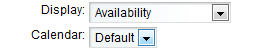
If charting availability, select Availability in the drop-down list.
The Availability chart shows element availability (not in a CRITICAL state) during a period of time. Failures are highlighted in red and are easy to identify at a glance.
Then, to configure the Availability chart:
-
(Optional) Select a calendar from the drop-down list.
-
-
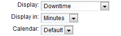
If charting downtime, select Downtime in the drop-down list.
The Downtime chart shows element downtime (in a CRITICAL state) during a period of time.
Then, to configure the Downtime chart:
-
Select the time interval from the drop-down list.
-
(Optional) Select a calendar from the drop-down list.
-
-
(Optional) In the field, specify a custom name for the series.
The name can display in the chart legend and/or the chart title. If left blank, the default name is formatted as ElementName,Profile,Expression for Performance Metrics charts and ElementName,SLA,Objective for SLA data charts.
If there is more than one matching series, when a regular expression is defined for the Expression, the default naming convention is used instead of the custom name.
-
(Optional) Specify a chart format for the series by selecting or from the drop-down list.
-
(Optional) Do one of the following to specify the color for the data series.
-
Select the radio button to have the color randomly selected.
-
Select radio button, then enter a six-character hex color value in the field.
-
-
(Conditional) Click the check box to use the associated configuration settings when the portlet is updated from an element selection in another portlet.
In this scenario, even though the element changes, the portlet continues using the selected configuration settings for charting the new element including chart type and other chart selections, as well as labels, type, and color selections as defined in this configuration.
When more than one configuration has this option selected and regular expressions are in use (Performance Metrics only), the Performance portlet uses settings from the configuration that first matches a profile expression for the element.
-
-
To specify time control settings for the chart, select one of the following:
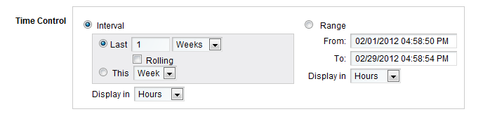
-
Interval: Defines a fixed interval.
Select only the current (This) hour/day/week/month or select multiple intervals (Last…).
If is selected, select the check box to calculate the interval using the current time as the ending of the interval. If rolling is unselected, the interval is calculated in full units and the end of the interval is the end of the preceding unit of time. For example, if the current time is 4:35pm and the interval is for the last 2 hours, without rolling the interval is 24pm. Whereas with rolling selected, the interval is 2:354:35pm.
Specify the time interval displayed in the chart from the list. Select Minutes, Hours, Days, Weeks or Months.
-
Range: Specifies a start and end date.
Click inside the or fields to open a calendar, then select a date.
Specify the time interval displayed in the chart from the list. Select Minutes, Hours, Days, Weeks or Months.
-
-
Customize the chart format and appearance using any of the chart title and size, output file format, line axis or x axis appearance, and date format options:
Chart Option
Description
General Chart
-
Chart Title: Specify a title for the chart. This displays at the top of the chart.
Use the variable $element$ to dynamically populate the chart title with the element name(s). For example,
Performance Data for $element$
shows the following title when the chart includes two elements:
Performance Data for Server1_Name, Server2_Name
-
Chart Title Style: Specify the font name, style and size to use for the chart title. The default is Name:Helvetica; Size:12.0; Style:Bold;. Changing the title color is optional.
-
Chart Width: The chart height as a percentage.
-
Chart Height: The chart width as a percentage.
-
Output Format: The type of file that the chart generates: FLASH, JPEG, or PNG.
Line Axis Style
-
Grid Color: A six-character hex color value to use for the color of horizontal grid lines.
-
Tick Style: Specify the style of the tick marks on the vertical axis. The default Name:Helvetica; Size:12.0; Style:Bold;. Changing the tick mark color is optional.
-
Label: Specify the text used to label the vertical axis.
-
Label Style: Specify the font name, size and style to use for the vertical axis label. The default is Name:Helvetica; Size:12.0; Style:Bold;. Changing the label color is optional.
X Axis Style
-
Grid Color: A six-character hex color value to use for the color of vertical grid lines.
-
Tick Style: The style of the tick marks on the horizontal axis. The default Name:Helvetica; Size:12.0; Style:Bold;. Changing the tick mark color is optional.
-
Label: Specify the text used to label the horizontal axis.
-
Label Style: Specify the font name, size and style to use for the horizontal axis label. The default is Name:Helvetica; Size:12.0; Style:Bold;. Changing the label color is optional.
Date Formats
-
Year: The syntax used to display the chart year. Defaults to yyyy.
-
Month: The syntax used to display the chart month. Defaults to MMMM.
-
Week: The syntax used to display the chart week. Defaults to MM/d.
-
Day: The syntax used to display the chart day. Defaults to MM/d.
-
Hour: The syntax used to display the chart hour. Defaults to h:mm:a.
-
Minute: The syntax used to display the chart hour. Defaults to hh:mm.
For more information on date formats, see the Oracle Web page for the SimpleDateFormat class.
-
-
(Optional) To enable chart view time options, select the check box.
The link displays at the top of the portlet on the dashboard page. If this option is deselected, users must go into the portlet Preferences to adjust any chart selections.
-
To plot all available data points, select the check box.
Up to 10,000 data points are plotted on the chart regardless of the time interval selected. If the option is unselected, the chart plots a maximum of:
-
60 data points when displaying in seconds.
-
360 data points when displaying in minutes.
-
160 data points when displaying in hours.
-
90 data points when displaying in days.
-
52 data points when displaying in weeks.
-
12 data points when displaying in months.
-
2 data points when displaying in years.
When the option enabled, it is possible to increase performance by reducing the number of data points returned while preserving the natural shape of the line. For more information about configuring this custom setting, see Section 7.8.2, Configuring Performance Data Point Retrieval from the Operations Center Server.
-
-
To display the date and time the chart was last updated, select the check box.
-
Click .