Layout Components
Layout Components are used to change the general layout of the Form.
Columns
The Column layout component can be used to split any area into two columns. Simply drag and drop the Column button onto the form and the area you drop it on will be split in two.

Field Set
A fieldset can be used to create a title of an area of the form. This is useful to put inside Layout components or in between lots of related fields. This form component is display only and will not be saved to the api.
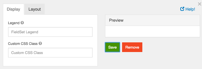
Fieldset Legend
Enter the legend that will appear for the fieldset.
Custom CSS Class
A custom CSS class to add to this component. You may add multiple class names separated by a space.
Panels
Panels are used to wrap groups of fields with a title and styling. These currently map to Bootstrap Panels.
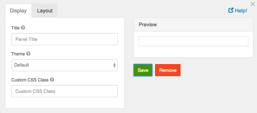
Panel Title
Enter the panel title that will be displayed at the top of the panel.
Theme
The theming of the panel. Select one of the options to have the class added to the wrapper div.
Custom CSS Class
A custom CSS class to add to this component. You may add multiple class names separated by a space.
Table
The table component allows creating a table with columns and rows that allow adding additional components within it.
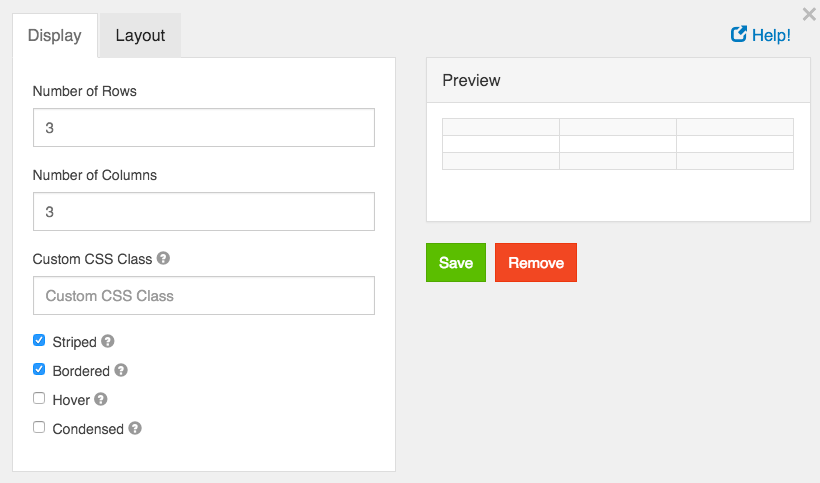
Number of Rows
The number of rows on the table. This can be adjusted at any time.
Number of Columns
The number of columns on the table. This can be adjusted at any time.
Custom CSS Class
A custom CSS class to add to this component. You may add multiple class names separated by a space.
Striped
Whether or not the table is striped for odd and even rows.
Bordered
Whether or not the table has a border set on it. (This can be changed by your own CSS as well)
Hover
Whether or not to add a hover class on rows when the mouse hovers over them.
Condensed
Whether or not to condense the size of each sell by removing padding.
Please note - Tables may not repsond well when collapsing to a mobile interface. Please utilize the Column component for a mobile reponsive layout option