Data Components
Hidden
A hidden field can be added to a form to create a resource property that can be custom set in the form. You can use javascript to set the value on the client side and when the form is submitted the value will be set on the resource. There is no front end widget for hidden fields.
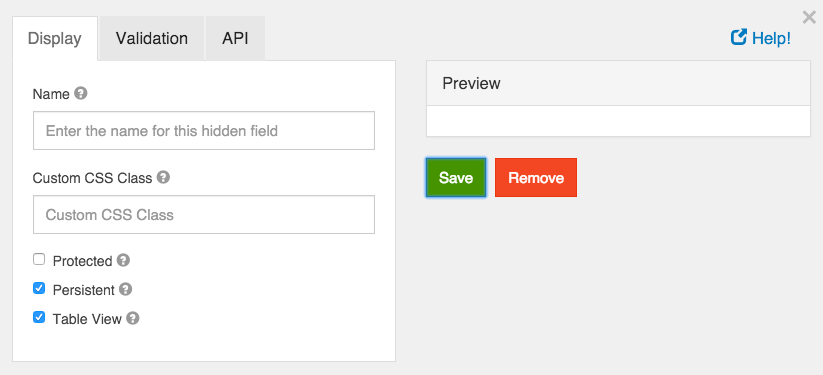
Name
The name for a hidden field is not displayed on the client side and is used for administration purposes only. The name is used to generate the automatic property name but this can be changed on the API tab on the component settings modal.
Custom CSS Class
A custom CSS class to add to this component. You may add multiple class names separated by a space.
Unique
If checked, this field will be enforced as unique for this form. Submissions will be checked to see if an existing value matches. This validation is currently server side only.
Protected
If checked, this field is for input only. When being queried by the API it will not appear in the properties and also should not appear in exported data. You won’t be able to see the value on form.io, but it will be stored in database under the hood.
Persistent
If checked, the field will be stored in the database. If you want a field to not save, uncheck this box. This is useful for fields like password validation that shouldn’t save.
Table View
If checked, this value will show up in the table view of the submissions list.
Container
A container is a wrapper around a set of fields similar to a fieldset. The major way they are different is the way that the data is stored. For most layout components field values are stored directly in the data of the submission.
For example, a fieldset with the following fields
firstName = First Name field lastName = Last Name field Would submit as
{
  data: {
    firstName: “Joe”,
    lastName: “Smith”
  }
}
However, with a container, the fields are put into an object with the container key. This is useful for creating more complex objects within your form.
For example, a container with the key user and the same fields above would submit as
{
 data: {
    user {
      firstName: “Joe”,
      lastName: “Smith”
    }
  }
}
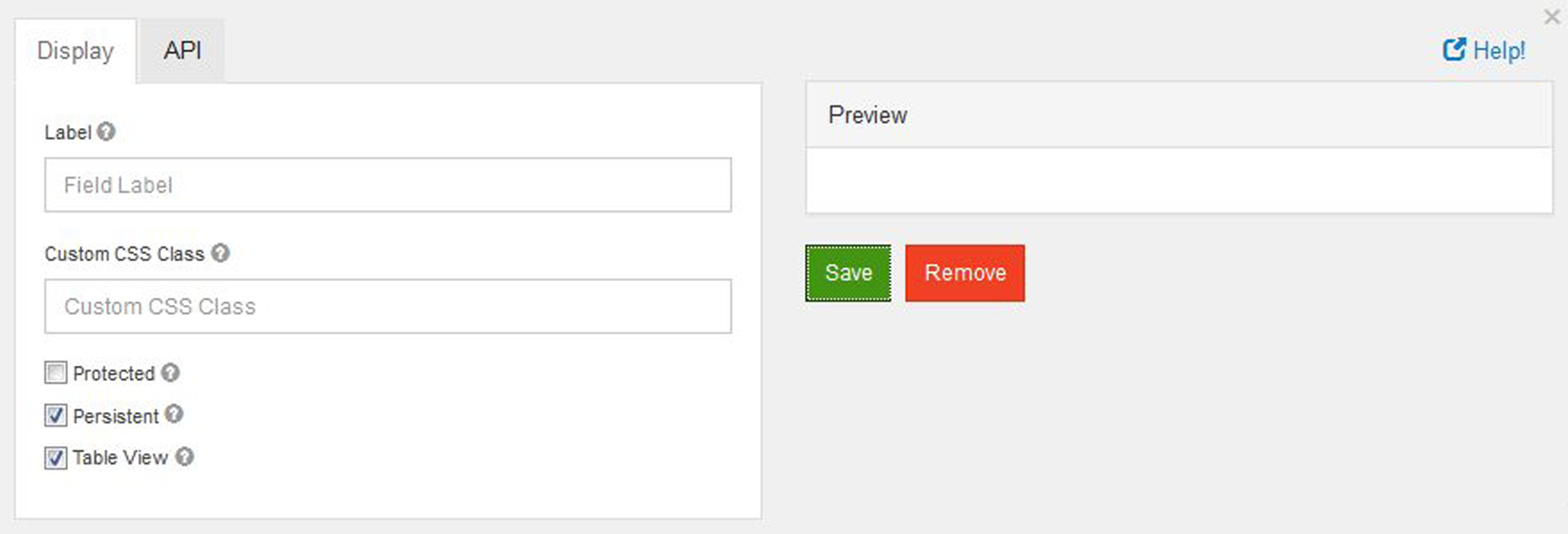
Label
The name or title for this component. Here label is only display at the time of creating or editing a form to represent container while adding form elements to it. It will later disappear in live.
Custom CSS Class
A custom CSS class to add to this component. You may add multiple class names separated by a space.
Protected
If checked, this field is for input only. When being queried by the API it will not appear in the properties and also should not appear in exported data. You won’t be able to see the value on form.io, but it will be stored in database under the hood.
Persistent
If checked, the field will be stored in the database. If you want a field to not save, uncheck this box. This is useful for fields like password validation that shouldn’t save.
Table View
If checked, this value will show up in the table view of the submissions list.
Data Grid
Data Grids allow users to add multiple components on to a line item grid. Once placed,
users can add multiple components inside of the Data Grid. Additionally, any number of grids can be added
within a form which is especially useful when needing the ability to add or duplicate multiple fields sets.
From the Data component menu, add the Data Gird (Array) to any active form. By default the grid is empty but can have other form components placed inside.
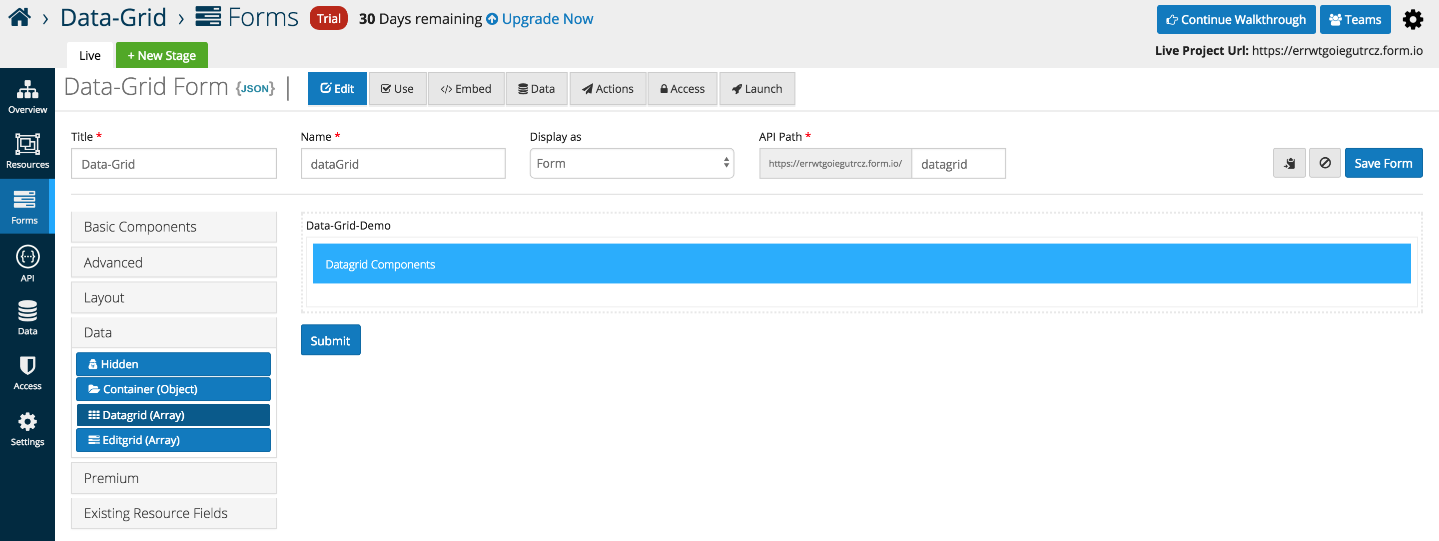
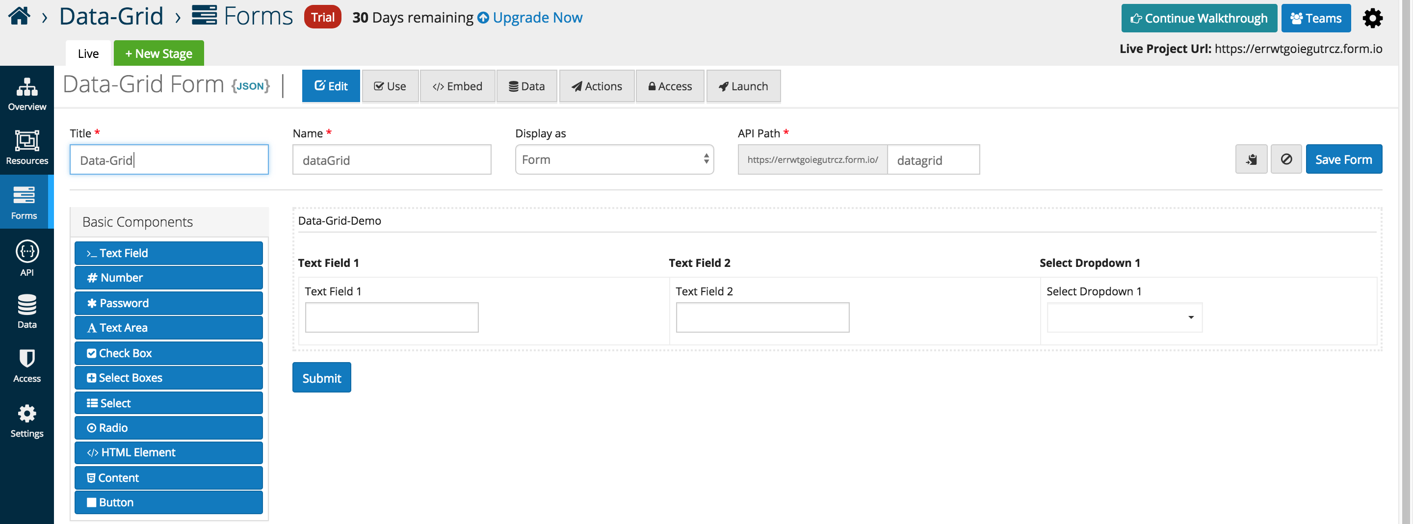
The example below illustrates three Basic Components placed inside of a Data Gird (Array). A new column is automatically added whenever another component is added the the data grid interface
Below is an in depth look at the specific data grid options that users can add or interface with as of the 5.0.0 release.
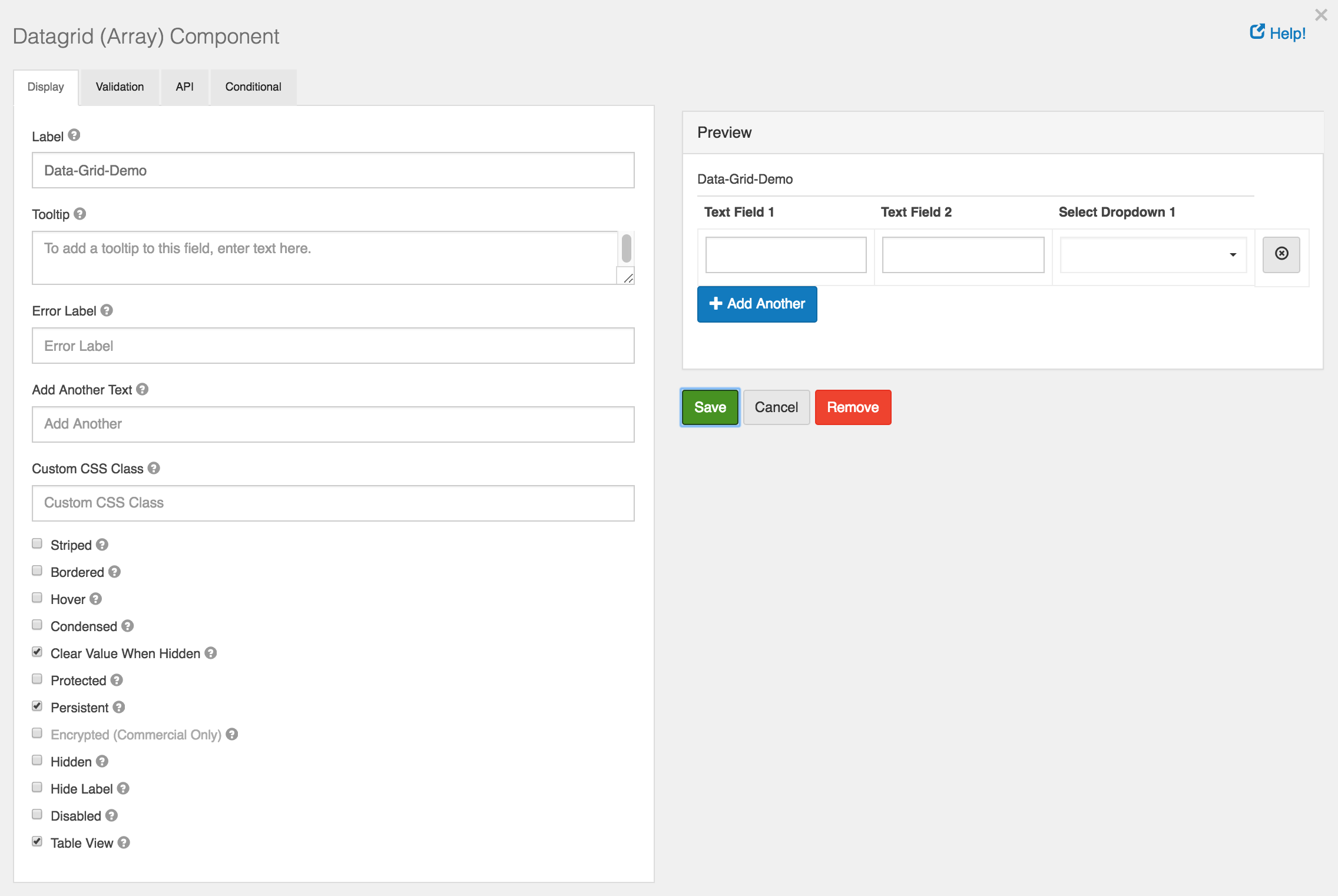
Add Another Text
- Text that will display for the Add Another button instead of the default.
Add Another Position
- Position for Add Another button with respect to Data Grid Array.
Striped
- Whether or not the table is striped for odd and even rows.
Bordered
- Whether or not the table has a border set on it. (This can be changed by your own CSS as well)
Hover
- Whether or not to add a hover class on rows when the mouse hovers over them.
Condensed
- Whether or not to condense the size of each sell by removing padding.
An example of the Data Grid displayed in the Use tab.
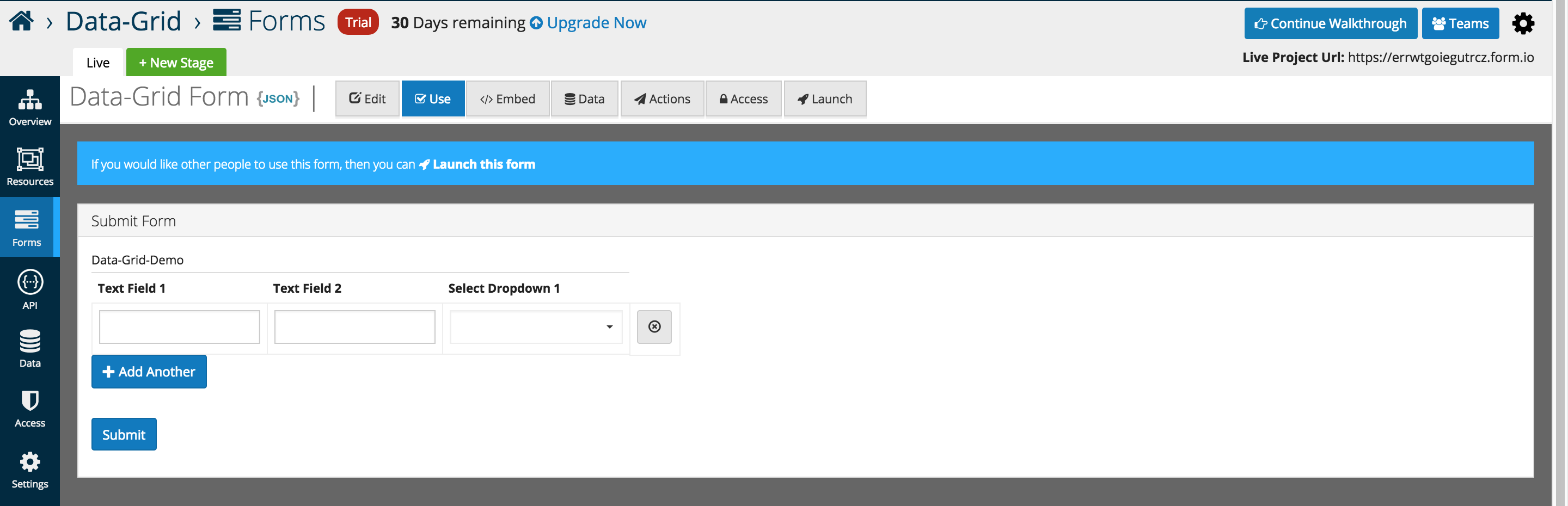
Rows can be dynamically added, and removed as highlighted below.
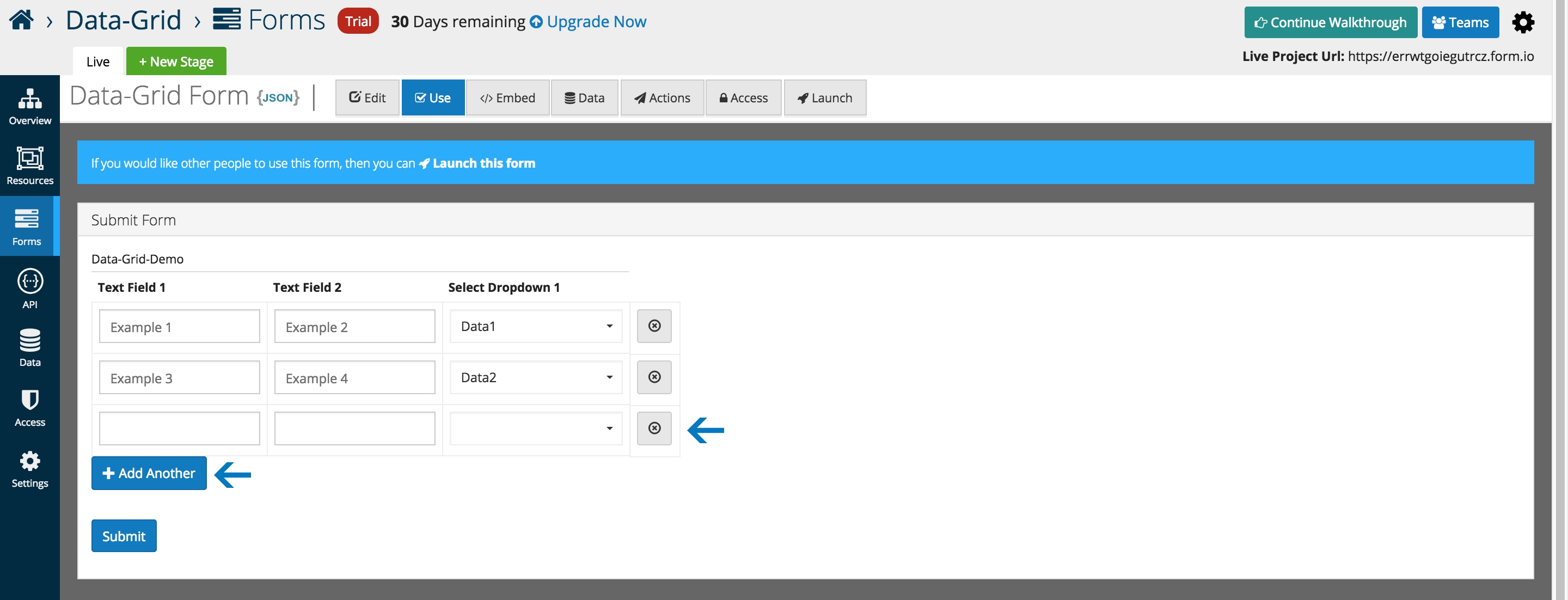
Data can be submitted and edited via the traditional platform interfaces.
Edit Grid
Edit Grids allow users to replicate an table like structure when it comes to the capture and display of form data. Users can add multiple components inside of the Edit Grid. Additionally, any number of grids can be added within a form which is especially useful when needing the ability to add or duplicate multiple fields sets.
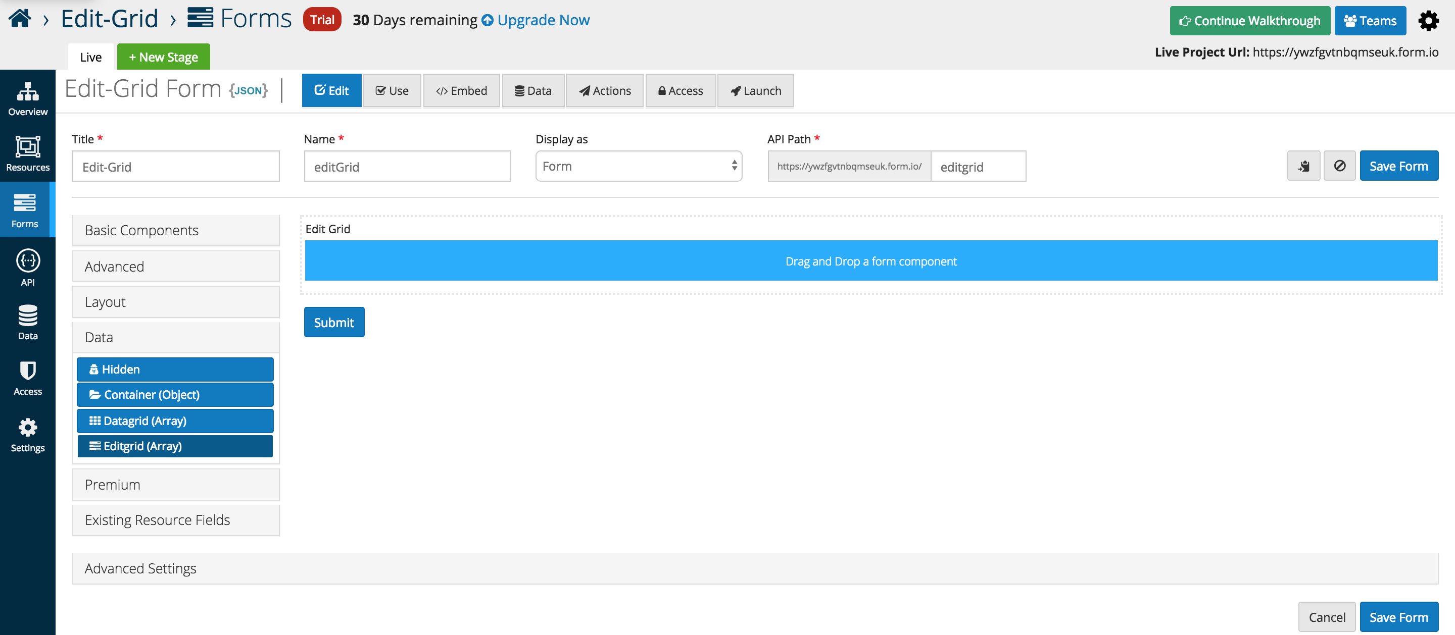
From the Data component menu, add the Edit Gird (Array) to any active form. By default the grid is empty but can have other form components placed inside.
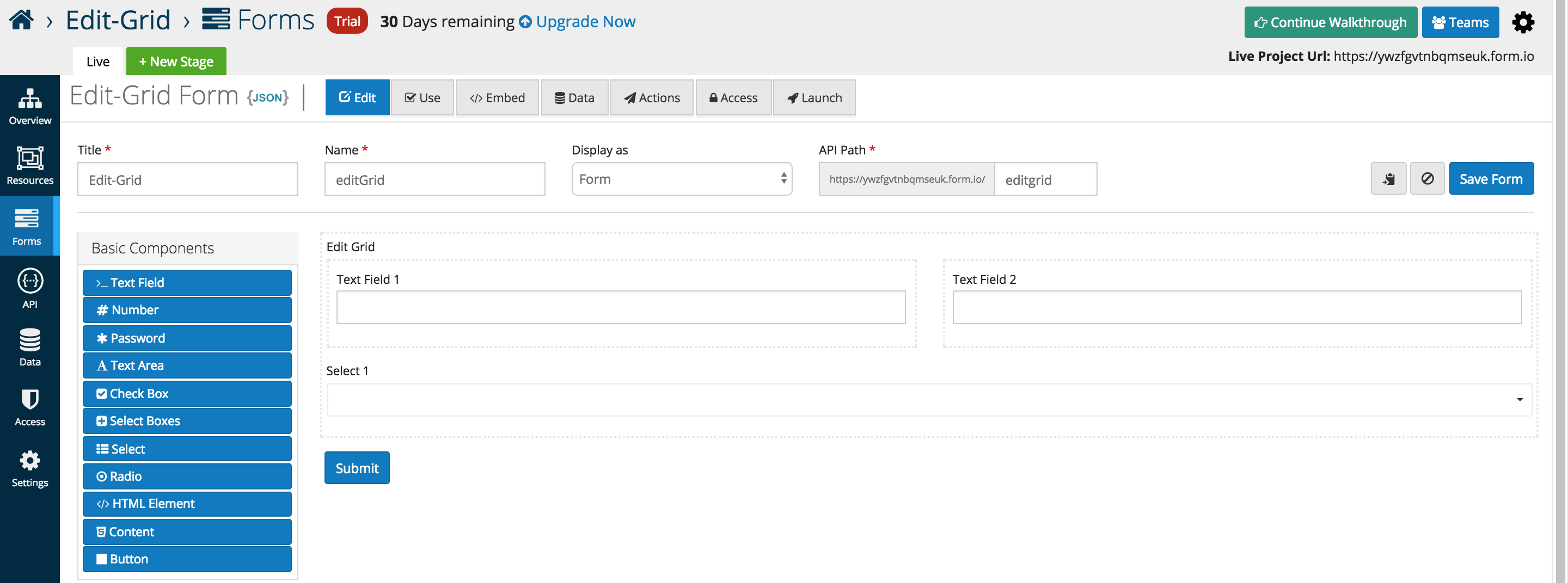
The example below illustrates three Basic Components placed inside of a Edit Gird (Array). Layout components can be used to replicate the split view below, and additional rows are added automatically when additional form elements are dragged into the interface.
Below is an in depth look at the specific data grid options that users can add or interface with as of the 5.0.0 release
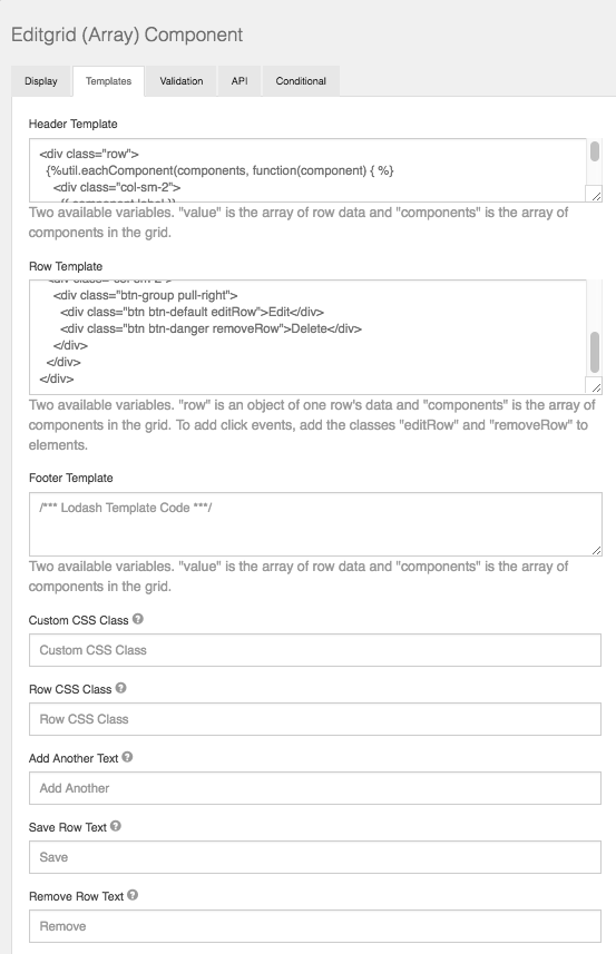
Templates
Edit Grid gives the user the flexibility to customize the grid to how they see fit using basic JavaScript. Within the Template section of the component settings, the user can modify what type of components are displayed within the grid row along with the Header/Footer.
Row CSS Class
CSS class to add to the edit row wrapper.
Add Another Text
Set the text of the Add Another button.
Save Row Text
Set the text of the Save Row button.
Remove Row Text
Set the text of the remove/delete Row button.
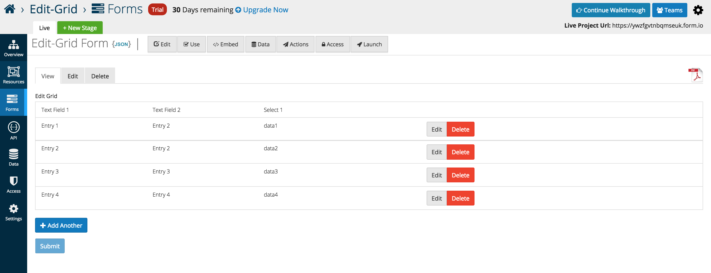
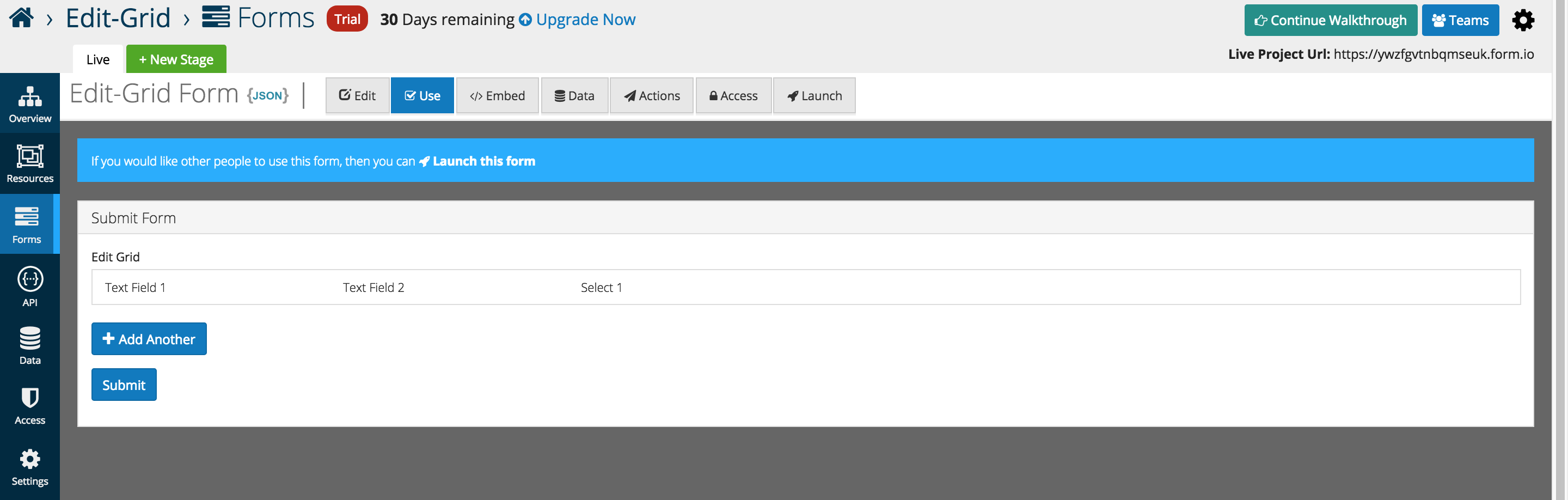
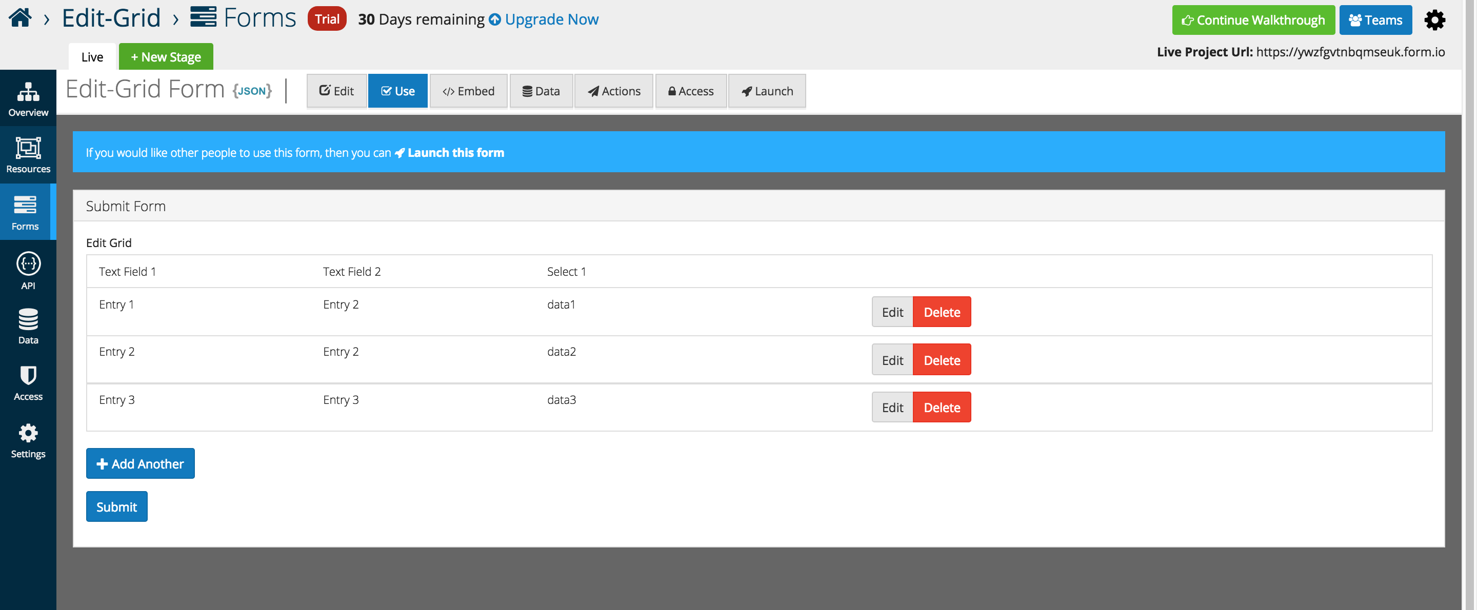
An example of the Edit Grid displayed in the Use tab.
As Entries are added the table displays the data below each respective header independent of the form layout.
The form layout is displayed when Add Another is pressed, and the form appears below the grid for user entry.
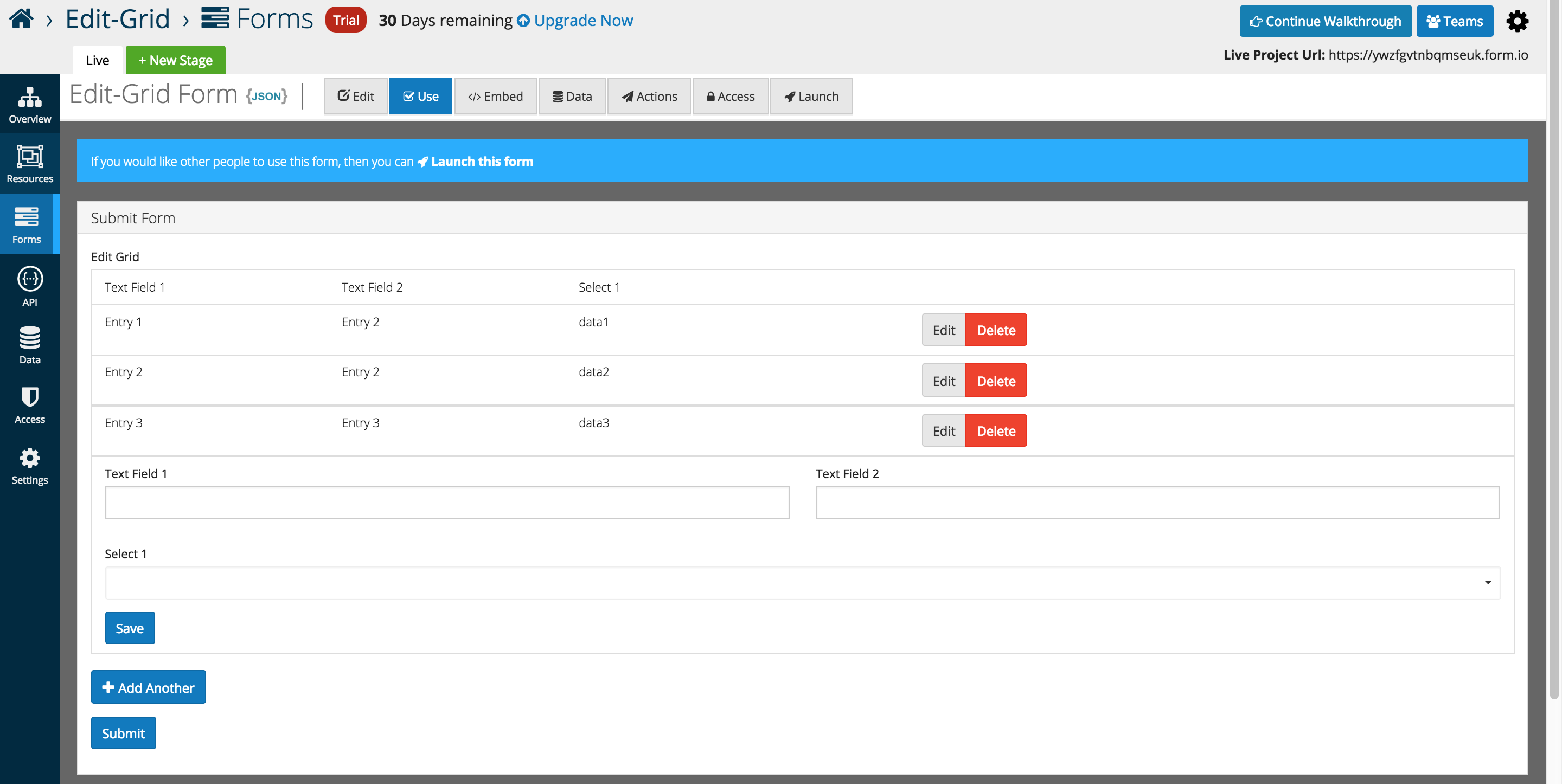
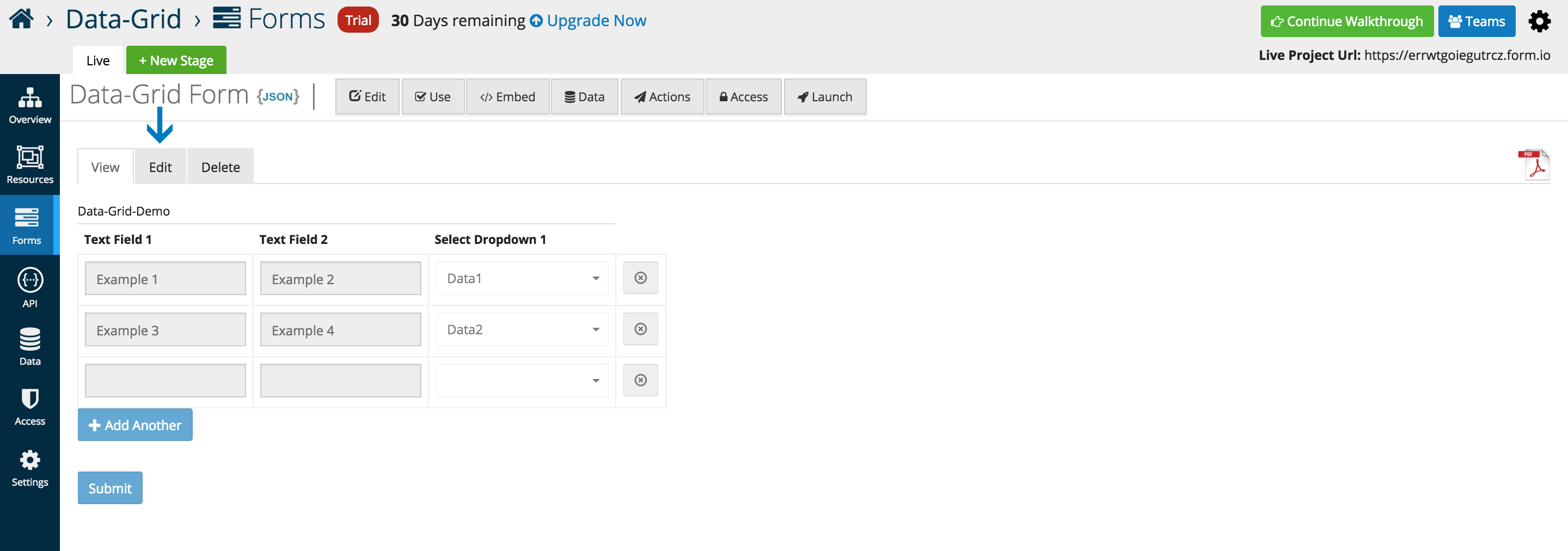
Once submitted, form data can be viewed and edit via traditional platform methods.