9.2 Understanding Chart Types
The type of charts available depends on the property for which you are analyzing performance. Three main types of charts are available: stacked bar charts, condition charts, and line charts. The chart type is automatically selected based on the type of property selected.
9.2.1 Understanding Stacked Bar Charts
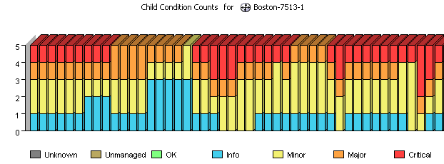
Stacked Bar charts are normally used for alarm severity counts or child condition counts. They provide the alarm totals by severity for an element at a given point in time. Figure 9-1 shows the child condition counts for an element:
Figure 9-1 Stacked Bar Chart
9.2.2 Understanding Condition Charts
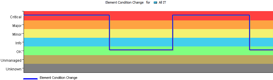
Condition charts use one or more lines to track element conditions over time. The background band of condition colors helps you identify the changes. The chart in illustrated in Figure 9-2 tracks changing conditions for an element.
Figure 9-2 Condition Line Chart in the Operations Center Console
When charting condition changes for performance metrics or SLAs, the chart render in the Performance report in Operations Center dashboard is a typical line chart and looks different from the stepped line chart that is available in the Operations Center console.
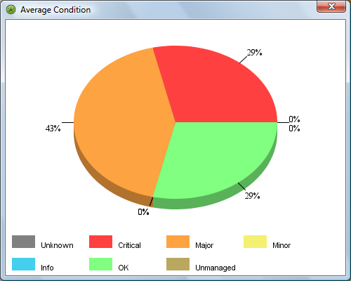
Average condition information is available in a pie chart from the Condition Line chart in the Operations Center console. The pie chart identifies the percentage of time that the element was in each condition (Critical, Major, Minor, and so on) for the given time period. The chart in Figure 9-3 shows the element was in Critical and Major condition for equal percentages of time, and in OK condition for the remaining 20 percent of the time:
Figure 9-3 Average Condition Pie Chart
9.2.3 Understanding Line Charts
Line charts use lines to connect property value data points over time. The chart illustrated in Figure 9-4 tracks two properties, the percentage of CPU utilization and idle time, for two elements. Different colored lines are used for each combination of property and element.
Figure 9-4 Multielement Line Chart
If only one element is charted, a single line can be displayed or an area line chart can be displayed in the Operations Center console. The area line chart fills in the range between zero and the line value to improve the visual presentation of data changes and trends.
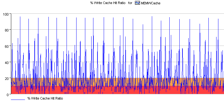
The area line chart illustrated in Figure 9-5 tracks the % Write Cache Hit Ratio property values every five minutes for one element, MEMWCache.
Figure 9-5 Area Line Chart
When available from the native element (on some and elements), the performance chart renders both warning and alarm thresholds visually. For example, in Figure 9-6 where the Write Cache Hit Ratio falls below 20, it is considered to be at warning level, and when falling below 10 it is a Critical violation:
Figure 9-6 Line Chart Including a Warning and Critical Threshold