8.2 Understanding the Chart Types
Each chart property displays in one of the chart types described in Table 8-1.
Table 8-1 Performance Chart Properties and Associated Chart Types
|
Chart Property |
Associated Chart Type |
|---|---|
|
Alarm Column |
Varies by data type. A Line chart is created for most columns, except for , which creates a Condition Line chart. |
|
Alarm Severity Counts |
Stacked Bar |
|
Child Condition Counts |
Stacked Bar |
|
Element Condition |
Condition (Line or Pie) |
|
Element Condition Change |
Condition (Line or Pie) |
|
Element Property |
Varies by data type. A Line chart is created for most properties, and a Condition Line or Pie chart is created for some properties. |
|
Performance Series |
Line |
|
Script |
Varies by data type. |
Other properties are also available to chart, depending on the properties captured, or if a Service Level Agreement is defined. For example, when a Service Level Agreement is applied with an availability objective, Availability and Outage Count properties are often available to chart.
Table 8-2 SLA Property Types and Corresponding Chart Types
|
Property Type |
Chart Type |
|---|---|
|
Availability |
Line |
|
Outage Count |
Stacked Bar |
When charting SLA metrics, it can take up to several minutes before a refreshed or new chart registers an update, while updates for other property types are received and charted in near-real-time. In this case, the server has not yet recorded update data for Availability and Outage Count properties.
When charting performance and SLA metrics, if there is no data for the time range selected, the chart displays with no data.
The following sections explain the four chart types:
8.2.1 Line Charts
Line charts display property values (other than alarms and condition) for an element. For more information, see Creating an Area Line Chart.
There are two types of Line charts:
-
The standard Line chart tracks values using a line on the Y‑axis:

-
The Area Line chart fills in the range between zero and the line value:

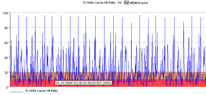
The Line chart can render both warning and alarm thresholds for some elements (such as and ). In Figure 8-1, when the Write Cache Hit Ratio falls below 20, it issues a WARNING level (orange) violation. When it falls below 10, it issues a CRITICAL (red) violation.
Figure 8-1 Line Chart: Some Performance Charts Include a Warning and CRITICAL Thresholds
8.2.2 Sted Bar Chart
The Sted Bar chart displays segmented values sted in a single bar for each time point.
In Figure 8-2, each sted bar shows the total number of alarms and segments each type of alarm condition (CRITICAL, MAJOR, MINOR, and so on) by color:
Figure 8-2 Sted Bar Chart
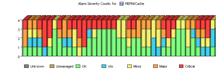
You can identify the changes in the ratio of CRITICAL (red) versus OK (green) alarms over time.
8.2.3 Condition Line Chart
The Condition Line chart uses a line to tr values over time.
Figure 8-3 shows that the element condition fluctuates mostly between CRITICAL and MAJOR during the displayed time period:
Figure 8-3 Condition Line Chart
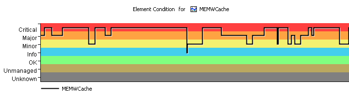
The background band of colors helps identify the changes in conditions over time.
8.2.4 Condition Pie Chart
A Condition Pie chart is related to the Condition Line chart.
Figure 8-4 shows the element was in CRITICAL and MAJOR condition for equal percentages of time, and in OK condition for the remaining 20 percent of the time:
Figure 8-4 Average Condition Pie Chart
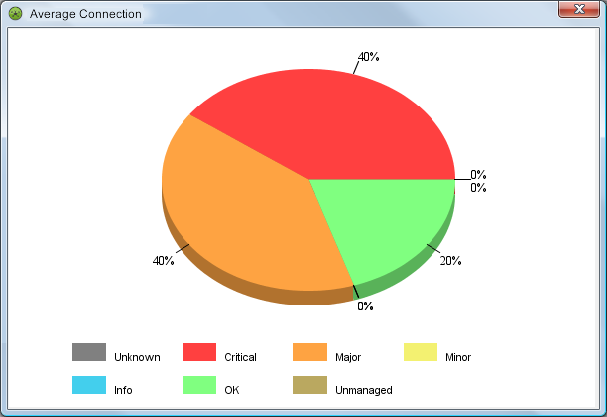
The Pie chart identifies the percentage of time that the element was in each condition (CRITICAL, MAJOR, MINOR, and so on) within a specific time period.
For more information, see Creating a Pie Chart of Condition Values.