6.7 Rendering Rules for Node Styles and Custom Graphics
This section describes the lookup strategy used to determine the node style or custom graphic rendering used for an element in a Layout view drawing.
It also provides examples using a series of step-by-step instructions. Re‑create the examples to understand how the node style/graphic representation works in the Layout view. Considering the numerous ways a node style can be applied to elements, it could be unclear which settings or overrides take precedence. Read through the section, then try the example steps to see first-hand how the node style settings and priorities work.
It is assumed the reader is a proficient user of Operations Center and the Layout view in particular. Many steps in this section are general in nature and it is assumed the reader knows how to navigate the Layout view and can create drawings and portals.
6.7.1 Element Rendering Overview
In the context of the Operations Center Layout view, element rendering is performed by locating the selected node style or graphic representation for a specific element in a specific drawing.
This property can be set in many places. A default lookup strategy determines which node style or graphic rendering to use for an element in a drawing. Referring to Figure 6-7, the lookup works from top to bottom:
Figure 6-7 Nodestyle Flowchart

The lookup strategy is performed in the following order:
-
binding | override (* DRAWING SPECIFIC)
Use this setting to override all other node styles and graphics in a drawing and assign a specific node style for a specific element.
-
element | graphic
An element in a drawing has a custom graphic defined for this instance of the element. This graphic is specified in the element’s Element Graphic drawing channel. This graphic might have been created by a user in v4.0, or it could result from a conversion from v3.5.x for an element that contained a custom graphic.
-
element | node style
An element in a drawing has a custom node style defined for this instance of the element. This graphic is specified in the Element Node Style drawing channel. This channel is merely a reference to a custom node style listed under > > .
-
element class | graphic
An element in a drawing has a class definition with a custom graphic defined. This graphic is specified in the Element Graphic drawing channel for this instance of the class definition, which appears in the branch of the hierarchy.
IMPORTANT:There is currently an open issue with these two element class options. Only Org type elements support these settings. This is a constraint put in place by the Metamodel implementation.
-
element class | node style
An element in a drawing has class definition with a custom node style defined. This is specified in the Element Node Style drawing channel for this instance of the class definition, which appears in the branch of the hierarchy.
-
binding | specify ( * DRAWING SPECIFIC)
An element was added to a drawing using the option. The user chose to set a node style for the all elements generated by this layout option.
HINT:This setting can be overridden by the higher priority settings that are found for each element in the binding.
-
Ambient ( * DRAWING SPECIFIC)
The Ambient node style changes all elements that currently use the system default node style. It is a way to quickly change multiple nodes at once. Drag and drop a node style to the drawing background.
-
System
There is no node style set on a drawing and no node style or graphic found for the target element by searching the list above.
The subsequent sections provide examples of how the element rendering priorities work. Start by creating custom classes and apply them to new elements, then create a corresponding portal. You can create several node styles and apply them.
6.7.2 Creating a Test Model
This sections provides an example that walks you through creating a new Metamodel class and applying the class to a set of elements. It also shows you how to manually bind an element to the drawing.
Creating a New Metamodel Class and Elements
To create a new Metamodel class and elements that use this class:
-
In the pane, under > > , create a new class named .
This class does not require changing any Metamodel settings.

-
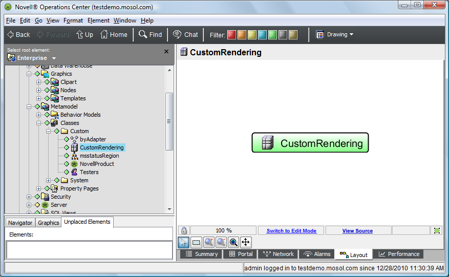
Select this new class in the pane, then switch to the Layout view.
The view should resemble the following:
-
Create a new element named .
-
In the pane, select .
Notice that the default node style used to represent the element is in the Layout view:

-
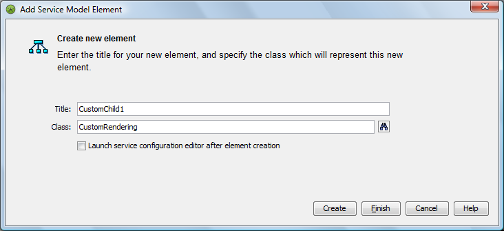
Create three child elements under named:
-
In the field, select the custom class (defined earlier in Step 1):
-
In the field, select the custom class .
-
In the field, leave the default class.
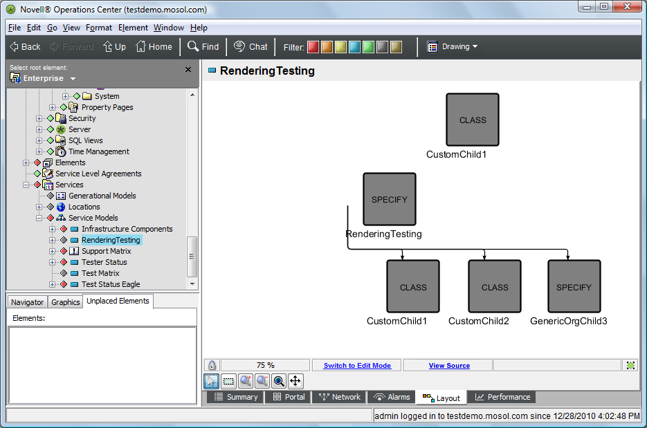
The resulting Layout view should resemble the following:

-
Creating a Manually Bound Element in the Drawing
To create a manually bound element inside a drawing:
-
In the Layout view, switch to Edit mode.
-
Drag and drop from the pane to the background of the drawing.
Make sure you drop the element the background and not on any of the existing elements.
-
Select from the pop‑up menu.
The resulting drawing resembles the following:

6.7.3 Viewing the Layout in the Dashboard
To view the layout in the Dashboard:
-
Create a default portal for the element.
The rendered portal should look identical to the Layout drawing shown here:

-
Deselect the check box in the Layout portlet so that the SVG layout is used.
6.7.4 Creating Node Styles for Testing
To create node styles for testing, do the following:
-
Under > > , create a node style named .
-
Edit the node style as follows:
-
Right-click the node style graphic, then select .
-
Change the <default> text to AMBIENT.
-
Add a text label beneath the square and bind the label to the option.
-
Select everything in the drawing, then right-click .
-
Save the drawing.
The following illustrates the resulting drawing:

-
-
Create a node style named and edit it as follows:
-
Change the <default> text to CLASS.
-
Add a text label beneath the square and bind that label to the option.
-
-
Create a node style named and edit it as follows:
-
Change the <default> text to ELEMENT.
-
Add a text label beneath the square and bind that label to the option.
-
-
Create a node style named and edit it as follows:
-
Change the <default> text to OVERRIDE.
-
Add a text label beneath the square and bind that label to the option.
-
-
Create a node style named and edit it as follows:
-
Change the <default> text to SPECIFY.
-
Add a text label beneath the square and bind that label to the option.
-
6.7.5 Applying the Ambient Node Style to the Drawing
The Ambient node style changes all elements that currently use the system default node style. It is a way to quickly change multiple nodes at once. Drag and drop a node style to the drawing background.
To apply the Ambient node style to all elements in a drawing:
-
In the pane, click > > .
At this point, no node style has been set relative to the drawing so the system default of Gradient Bubble is used.
-
Under > > , drag and drop the node style to the background of the drawing.
Be sure to drop on the background and not on an element in the drawing.
-
When prompted, click to set the Ambient node style.
-
Verify that the drawing resembles the following:

-
Save the drawing.
-
Refresh the associated Operations Center dashboard page and verify the same view displays.
6.7.6 Changing the Node Style through Binding
At this point, the Ambient node style has been set in the drawing. Now, you will change the node style for a specific element, then when prompted, change the node style for all nodes in the drawing.
The following example applies the binding | specify switch.
To update the node style for all drawing nodes:
-
In the pane, under > > , drag and drop the node style to the element in the drawing.
-
Select from the menu.

The following results occur:
-
The binding node style is set for the binding tree that starts with as the root.
-
The Ambient node style also changes, as was selected.
-
Verify that the drawing resembles the figure below. The manually-bound CustomChild1 is also rendered using the SPECIFY node style because the AMBIENT node style was changed when was selected.

-
-
Save the drawing.
-
Refresh the Operations Center dashboard page and verify the view above displays.
6.7.7 Applying a Node Style to a Class
The following section of the example applies a node style to a class and tests the element class | node style switch.
To apply a node style to a class:
-
In the pane, under the hierarchy, select the custom class.
-
On the console toolbar, switch to the drawing channel.
-
In the pane, under > > , drag and drop the node style to the Layout view.
This sets the node style to for the element class.

-
Change the view back to the channel.
-
In the pane, click > and verify that all element instances of the custom class now use the node style.
This feature allows you to control node styles from the class level.
The view should resemble the following:
The elements whose class is are easily identified by having CustomClass in their names. Only these elements should use the node style that shows CLASS inside the node.
-
Refresh the Operations Center dashboard page and verify the same view displays.