3.2 Using Drawing Tools
The Layout view provides a full set of drawing tools. These tools function much the same way as features found in other drawing products. Add text, colored shapes and imported clipart to provide additional information and enhance the appearance of a drawing.
In Edit mode, the full drawing toolbar displays along the bottom of the Layout view:
Figure 3-2 Drawing Toolbar

Each tool button has a roll-over tooltip. Place the mouse over a button and a tooltip displays the button name.
This section describes the following drawing tools:
3.2.1 Selecting Objects
There are two selection modes in the Layout view:
-
Normal: Grouped objects respect the layering of a group of objects. A group has to be ungrouped in order for a single object within the group to be selected and altered.
-
Flattened: The layers created by object groupings are “flattened” and single objects in the group can easily be selected and altered without ungrouping all.
To select objects:
-
To select complex items (grouped items) as a single item, click
 ().
().
-
To select and move a single item that is part of a group, click
 ().
().
3.2.2 Adding Text
To add text, such as a drawing title:
-
Click
 ().
().
-
Click the location where the text should display to open the Text dialog box:

-
Enter the text, then click .
The text displays in the drawing:

The default text is black, 14 point. Use the and panes to change the color or font.
A related feature is dynamic binding of text content to an element name or attribute, so the text is updated automatically. For more information, see .
-
If necessary, click and drag the text to a new location.
3.2.3 Adding Shapes
Add shapes to group a set of elements or call attention to an area of the drawing.
To draw a standard shape:
-
Select one of the following shape buttons on the drawing toolbar:
Button
Shape Name

Rectangle

Circle

Ellipse

Polygon

Triangle

Diamond
-
Drag to draw an outline of the shape anyplace in the view.
-
Release the mouse button to display the finished shape.
-
Click and drag any of the shape’s endpoints to modify the size or dimensions of the shape.
-
Change almost any feature of a shape using the Properties palette: the line and fill colors, line shapes and width, shape shadows, and so on.
For more information, see Section 5.0, Adding Elements and Updating Drawing Components Using Element Properties.
Another important feature is binding the shape fill color (or text color) to an element condition color. This feature is described in .
3.2.4 Drawing Lines and Arrows
To draw a line or arrow:
-
Select one of the following line shape buttons in the drawing tools toolbar, then follow the directions in the table:
Button
Description

Line.
-
Click to start and drag to draw the line.
-
Release the mouse to finish drawing.
-
To change the line width or add arrow heads, see .
-
To snap the line in 15 degree increments, press Shift while drawing the line end points.

Add Connection.
Connects two drawing elements.
-
Position the mouse over an element to display blue “x” s at the connection points.
-
Click one blue “x” to start the line.
-
Drag the line and click a blue “x” on a different element.
The line displays.

Block Arrow.
Click and drag to draw the arrow. Release the mouse to finish drawing.
-
-
To modify the line angle, simply click and drag one of the end points.
Move the line by clicking and dragging its midpoint.
3.2.5 Drawing Freehand Shapes and Lines
A few buttons on the toolbar enable freehand drawing of lines or shapes, depending on whether you select a fill color.
To use the freehand drawing buttons:
-
In the toolbar, select one of the following freehand buttons:
Button
Description

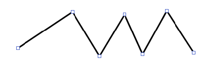
Polyline

Simple Curve

Complex Curve
-
Click to start the line, then drag to draw the first line segment.
-
Click once to stop drawing the line segment.
-
Drag to draw the next segment.
HINT:To snap a polyline in 15 degree increments to create curves, press Shift while drawing.
-
Repeat Step 3 and Step 4 to draw as many line segments as needed.
-
When finished drawing all segments, double-click to finish the line.
-
To fill the shape drawn by the line, select a fill color.
The following illustrate the difference between unfilled and filled polylines: