5.5 Form Control Reference
This section describes the controls you can add to a form.
Table 5-5 Control Types and Supported Data Types
|
Control Type |
Data Types |
|
||||||
|---|---|---|---|---|---|---|---|---|
|
Boolean |
Date |
Decimal |
DN |
Integer |
String |
Time |
ResourceRequest |
|
|
x |
x |
x |
x |
x |
|
|||
|
x |
|
|||||||
|
x |
|
|||||||
|
x |
|
|||||||
|
x |
|
|||||||
|
x |
|
|||||||
|
x |
|
|||||||
|
x |
|
|||||||
|
x |
|
|||||||
|
|
|
|
|
x |
|
|
|
|
|
|
|
|
x |
|
|
|
|
x |
x |
x |
x |
|
||||
|
x |
x |
x |
x |
|
||||
|
|
|
|
|
x |
|
|
|
|
x |
x |
x |
x |
|
||||
|
x |
|
|||||||
|
x |
x |
x |
x |
|
||||
|
x |
x |
x |
x |
|
||||
|
x |
|
|||||||
|
x |
|
|||||||
|
x |
|
|
|
|
|
|
|
|
|
x |
|
|||||||
|
x |
|
|||||||
5.5.5 CheckBoxPickList
Use the CheckBoxPickList control to allow users to view and choose one or more values from a dynamically generated list of choices displayed as check boxes.
When the associated data type is a DN retrieved from the Identity Vault, you can display the check box label as the fully qualified DN or use the Display expression property to specify the attributes to display instead.
Figure 5-2 Sample CheckBoxPickList Control

Table 5-7 CheckboxPickList Properties
|
Property Name |
Description |
|---|---|
|
|
When you populate this control with a DN retrieved from the Identity Vault and you want that value to display in a user-friendly fashion, you should choose an entity from the drop-down list and specify a set of attributes in the Display expression property. Leave this value blank if you want to display the full DN or CN value retrieved from the Identity Vault. The entity you choose must have the directory abstraction layer View property set to True and be the entity whose DN you are retrieving from the Identity Vault. |
|
|
Required when you specify an . Choose the attributes to display as the check box labels. For example, to display the user entity’s first and last name attributes, construct an expression like this: FirstName LastName. The attribute’s directory abstraction layer properties for View, Read, Search, and Required must be set to True. |
|
|
When this option is set to True, users can select more than one entry. |
|
|
Apply an HTML style attribute to the field body. Example: padding-top:5px;background-color:red |
|
|
Apply one or more CSS class styles to the field body. You can view the classes that are available for your User Application portal by logging into the User Application, navigating to , then clicking the button for the portal theme you are using. If you leave the field blank, it defaults to the nv-fontExtraSmall class. Example: nv-fontMedium nv-backgroundColor3 Separate class names with spaces. |
|
|
Apply an HTML style attribute to the field label. Example: color:red |
|
|
Apply one or more CSS class styles to the field label. You can view the classes that are available for your User Application portal by logging into the User Application, navigating to , then clicking the button for the portal theme you are using. If you leave the field blank, it defaults to the nv-formFieldLabel class. Example: nv-color5 Separate class names with spaces. |
|
|
When this option is set to True, two lists are displayed, one for the unselected values and another for the selected values. The Allow multiple selections property must be set to True. If set to False, is ignored. |
|
|
When this option is set to True, sorts results in ascending order. For details, see Sort Order. |
5.5.6 DatePicker
Use this control for display and entry of a date and time. This allows users to choose a date from a pop-up calendar or type a date in a text field. At runtime, the form automatically validates the date by using the format for the user’s locale and time zone. If the user enters an incorrect format, the form displays an error message. The DatePicker control’s tooltip displays the valid date format. The default DatePicker control looks like this:
Figure 5-3 Sample DatePicker Control

When the Show date picker property is True, the form displays the date field along with a button. When the user clicks the button, the form launches a calendar for the user to select the date. The calendar pop-up looks like this:
Figure 5-4 Sample Calendar Control
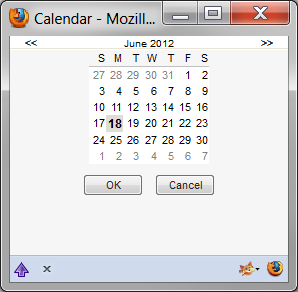
Table 5-8 DatePicker Control Properties
|
Property name |
Description |
|---|---|
|
|
When this option is set to False, the Calendar pop-up does not display the time. |
|
|
A comma-separated, single-quoted list of values displayed by the Calendar pop-up to indicate the day of the week. This value is localizable. |
|
|
Apply an HTML style attribute to the field body. Example: padding-top:5px;background-color:red |
|
|
Apply one or more CSS class styles to the field body. You can view the classes that are available for your User Application portal by logging into the User Application, navigating to , then clicking the button for the portal theme you are using. If you leave the field blank, it defaults to the nv-fontExtraSmall class. Example: nv-fontMedium nv-backgroundColor3 Separate class names with spaces. |
|
|
Use this field to configure the field’s visible width on the form. The default is 200 pixels. |
|
|
Apply an HTML style attribute to the field label. Example: color:red |
|
|
Apply one or more CSS class styles to the field label. You can view the classes that are available for your User Application portal by logging into the User Application, navigating to , then clicking the button for the portal theme you are using. If you leave the field blank, it defaults to the nv-formFieldLabel class. Example: nv-color5 Separate class names with spaces. |
|
|
A comma-separated, single-quoted list of values displayed by the Calendar pop-up to indicate the month name. This value is localizable. |
|
|
When this option is set to True, displays the calendar pop-up. If it is set to False, the calendar pop-up does not display. Users must type the date in the text field by using the proper format for their locale. |
5.5.7 DateTimePicker
Use this control for display and entry of a date and time for a Time data type. This allows users to choose a date and time from a pop-up calendar or type a value in a text field. At runtime, the form automatically validates the date and time by using the format for the user’s locale and time zone. If the user enters an incorrect format, the form displays an error message. The DateTimePicker tooltip displays the valid date format. The default control looks like this:
Figure 5-5 Sample DateTimePicker Control

When the property is set to True, the form displays a text field followed by a calendar button. When the user clicks the calendar button, the form launches a calendar control for the user to select the date and time values. The calendar pop-up looks like this:
Figure 5-6 DateTimePicker Calendar Control
Table 5-9 DateTimePicker Control Properties
|
Property name |
Description |
|---|---|
|
|
A comma-separated, single-quoted list of values displayed by the Calendar pop-up to indicate the day of the week. This value is localizable. |
|
|
Use this field to configure the field’s visible width on the form. The default is 200 pixels. |
|
|
When this option is set to False, the Calendar pop-up does not display the time. |
|
|
A comma-separated, single-quoted list of values displayed by the Calendar pop-up to indicate the month name. This value is localizable. |
|
|
When this option is set to True, it displays the calendar pop-up. If it is set to False, the calendar pop-up does not display. Users must type the proper format for the locale when they type the date in the text field. |
5.5.8 DNContainer
Use this control to allow users to select a container object from within the root container that you specify. You can use this control to limit the user to a subtree of a container. This is a specialized version of the DNLookup control.
Figure 5-7 DNContainer Control With Root Container Specified
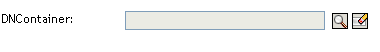
Table 5-10 DNContainer Control Properties
|
Property name |
Description |
|---|---|
|
|
Choose an entity from the drop-down list. The entity that you choose limits the users ability to look up objects within the specified entity’s container. If you specify an entity key and a root container, the entity key takes precedence. |
|
|
Apply an HTML style attribute to the field body. Example: padding-top:5px;background-color:red |
|
|
Apply one or more CSS class styles to the field body. You can view the classes that are available for your User Application portal by logging into the User Application, navigating to , then clicking the button for the portal theme you are using. If you leave the field blank, it defaults to the nv-fontExtraSmall class. Example: nv-fontMedium nv-backgroundColor3 Separate class names with spaces. |
|
|
Use this field to configure the field’s visible width on the form. The default is 200 pixels. |
|
|
Apply an HTML style attribute to the field label. Example: color:red |
|
|
Apply one or more CSS class styles to the field label. You can view the classes that are available for your User Application portal by logging into the User Application, navigating to , then clicking the button for the portal theme you are using. If you leave the field blank, it defaults to the nv-formFieldLabel class. Example: nv-color5 Separate class names with spaces. |
|
|
Specify a root container for lookups when users click the button. |
|
|
If set to True, the form displays the |
|
|
If set to True, the form displays the |
|
|
If set to True, the form displays the |
Displaying the Container Description Instead of the Container O/OU Name
Some additional steps are required to take advantage of an Identity Manager 4.5 DNContainer form field enhancement. This enhancement allows you to display the container description instead of the container O/OU name.
To enable the DNContainer enhancement, you need to manually update the Designer install to add properties to the DNContainer control. Then, you need to create a DAL entity corresponding to the container for which you want to display an attribute. Finally, you need to use the form editor to choose the entity and attribute.
-
Locate the following file in your Designer install:
/opt/novell/idm/Designer/plugins/com.novell.core.scriptengineshell_4.5*/lib/UIRegistry.jar
-
Back it up first, then use a suitable jar/zip tool to modify the file within the jar:
com\novell\srvprv\impl\uictrl\UIControlRegistry.xml
-
Locate the <ctrl key="DNContainer" section and add the following properties at the end:
<prop name="display-entitydef" type="string" since="1.9"> <display-label rb-key="LAB_DIS_ENTITYDEF"/> </prop> <prop name="display-exp" type="expression" since="1.9"> <display-label rb-key="LAB_DIS_EXPRESSION"/> </prop> -
Put this file back into the JAR in its original location and start Designer.
-
In Designer, create a new DAL entry with an unused name, such as myDescriptionLookup.
-
For the base class of this DAL entry, choose , and pick the attribute you want to show (for example ).
-
When the DAL editor is open, change the LDAP name of the class to . This allows you to view the Description for Organizations, Organizational Units, and so forth.
-
To use the new DAL entry, open a PRD and go to a form. Add or pick a field.
-
Fill in the two new fields (, ) with the values specified above (myDescriptionLookup, Description).
-
Deploy the new DAL entry and the PRD.
-
On the User Application, clear the cache or restart the server.
-
Test the new PRD to ensure that the descriptions are shown instead of the cn in the DNContainer control.
Make sure the containers you are going to show have a Description value; otherwise, cn is used. Containers, by default, leave this value blank.
5.5.9 DNDisplay
Use this control to display a read-only DN. You populate the control from flowdata. The control can display the full DN or a set of attributes associated with the DN depending on the properties you set. The DNDisplay control cannot be modified by the workflow engine. For this reason, it is not available for post activity mapping.
Figure 5-8 Sample DNDisplay

Figure 5-9 Sample DNDisplay with Display Expression Specified

Table 5-11 DNDisplay Control Properties
|
Property name |
Description |
|---|---|
|
|
Leave this value blank if you want to display the full DN or CN value. If you want to mask the DN by displaying attributes instead, launch the expression builder and select the desired attributes from the list. (You must first specify an .) For example, to show the user entity’s first and last name attributes, construct an expression like this: FirstName LastName. Make sure the attribute’s View, Read, Search, and Required properties are set to True in the directory abstraction layer. See Section 3.7.2, Attribute Properties. |
|
|
Leave this value blank if you want to display the full DN or CN value retrieved from the Identity Vault. If you want to mask the DN or CN by displaying attributes instead, choose the entity from the drop-down list and specify a set of attributes in the property. The entity you choose must:
For more information, see Section 5.6, Working with Distinguished Names. |
|
|
Apply an HTML style attribute to the field body. Example: padding-top:5px;background-color:red |
|
|
Apply one or more CSS class styles to the field body. You can view the classes that are available for your User Application portal by logging into the User Application, navigating to , then clicking the button for the portal theme you are using. If you leave the field blank, it defaults to the nv-fontExtraSmall class. Example: nv-fontMedium nv-backgroundColor3 Separate class names with spaces. |
|
|
Apply an HTML style attribute to the field label. Example: color:red |
|
|
Apply one or more CSS class styles to the field label. You can view the classes that are available for your User Application portal by logging into the User Application, navigating to then clicking the button for the portal theme you are using. If you leave the field blank, it defaults to the nv-formFieldLabel class. Example: nv-color5 Separate class names with spaces. |
5.5.10 DNLookup
Use this control to allow users to search and retrieve DNs from the Identity Vault. You can initialize the control with a DN from the flowdata. You set properties to control the entities and containers that the user can search and the format of the DN.
Figure 5-10 Sample DNLookup Control

The buttons associated with the DNLookup control are described in Table 5-12.
Table 5-12 DNLookup Control Buttons
|
Button |
Description |
|---|---|

|
Launches an object lookup dialog box. You define whether the dialog box displays containers or objects via the property. The attributes shown in the drop-down list ( in the above example) are specified in the directory abstraction layer. The availability of this button is controlled by the Show object selector property. |

|
Show history. Allows users to view the history of objects that they have searched. They can select from this list or clear its contents. The availability of this button is controlled by the Show object history button property. |

|
Reset field. Deletes the field contents. The availability of this button is controlled by the Show clear button property. |
Table 5-13 DNLookup Control Properties
|
Property Name |
Description |
|---|---|
|
|
This property only applies when you initialize the control from flowdata. Leave this value blank if you want to display the full DN or CN value. If you want to mask the DN by displaying attributes instead, launch the Expression Builder and select the desired attributes from the list. (You must first specify an .) For example, to show the user entity’s first and last name attributes, construct an expression like this: FirstName LastName. Make sure the attribute’s View, Read, Search, and Required properties are set to True in the directory abstraction layer. See Section 3.7.2, Attribute Properties. |
|
|
This property specifies the entity or containers that will be searched when you click the object selector button. If you initialize the control from flowdata, you can configure the control to display an attribute value of the entity rather than the full DN or CN value. If you want to mask the DN or CN by displaying attributes instead, choose the entity from the drop-down list, specify a set of attributes in the property. The entity you choose must:
For more information, Section 5.6, Working with Distinguished Names. |
|
|
Apply an HTML style attribute to the field body. Example: padding-top:5px;background-color:red |
|
|
Apply one or more CSS class styles to the field body. You can view the classes that are available for your User Application portal by logging into the User Application, navigating to , then clicking the button for the portal theme you are using. If you leave the field blank, it defaults to the nv-fontExtraSmall class. Example: nv-fontMedium nv-backgroundColor3 Separate class names with spaces. |
|
|
Apply an HTML style attribute to the field label. Example: color:red |
|
|
Apply one or more CSS class styles to the field label. You can view the classes that are available for your User Application portal by logging into the User Application, navigating to , then clicking the button for the portal theme you are using. If you leave the field blank, it defaults to the nv-formFieldLabel class. Example: nv-color5 Separate class names with spaces. |
|
|
Determines whether the object selector dialog box performs an Object Lookup or a Container Lookup. : Causes the object selector dialog box to perform an object lookup. You specify the lookup criteria via the property. : Causes the object selector dialog box to display one or more containers for selection. The containers for searching are determined by the property, which is specified in the directory abstraction layer for the entity named in the required property. For example, if the property is Group, the search container is set to %group-root% by default. If no search container is used, the search root specified during the User Application installation is used. |
|
|
Use this field to configure the field’s visible width on the form. The default is 200 pixels. |
|
|
If this option is set to True, the form displays the button. |
|
|
If this option is set to True, the form displays the button. |
|
|
If this option is set to True, the form displays the button. |
5.5.11 DNMaker
Use this control to allow users to construct a DN value by specifying a naming value and choosing a container.
Figure 5-11 Sample DNMaker Control

Table 5-14 DNMaker Control Buttons
|
Button |
Description |
|---|---|
|
|
Launches an object selector for container searches. The container search root is defined for the entity specified in the Entity used for object lookup property. The availability of this button is controlled by the Show object selector property. |
|
|
. Allows users to view the history of objects that they have searched. They can select from this list or clear its contents. The availability of this button is controlled by the Show object history button property. If the root container is specified for lookups, the Show history button is not shown even if the property is set to True. This has been done for security reasons. |
|
|
. Deletes the field contents. The availability of this button is controlled by the Show clear button property. |
Table 5-15 DNMaker Control Properties
|
Property |
Description |
|---|---|
|
|
A required field. Choose an entity from the drop-down list. This determines the search that is launched when the user clicks the object selector button. If you specify an entity key and a root container, the entity key takes precedence |
|
|
The naming attribute used to construct the final DN. This value displays next to the control’s display label as an extra hint to the user. |
|
|
Apply an HTML style attribute to the field body. Example: padding-top:5px;background-color:red |
|
|
Apply one or more CSS class styles to the field body. You can view the classes that are available for your User Application portal by logging into the User Application, navigating to , then clicking the button for the portal theme you are using. If you leave the field blank, it defaults to the nv-fontExtraSmall class. Example: nv-fontMedium nv-backgroundColor3 Separate class names with spaces. |
|
|
Apply an HTML style attribute to the field label. Example: color:red |
|
|
Apply one or more CSS class styles to the field label. You can view the classes that are available for your User Application portal by logging into the User Application, navigating to , then clicking the button for the portal theme you are using. If you leave the field blank, it defaults to the nv-formFieldLabel class. Example: nv-color5 Separate class names with spaces. |
|
|
Specify a root container for lookups when users click the object selector button. If you do not specify a Root container, the User Application uses the container for the entity in the directory abstraction layer property called Search Container. If a search container is not specified for the specified entity, then the Root Container DN specified during the User Application installation is used. If you specify an entity key and a root container, the entity key takes precedence. |
|
|
If this option is set to True, the form displays the button. |
|
|
If this option is set to True, the form displays the button. |
|
|
If this option is set to True, the form displays the button. |
5.5.12 DNQuery
DNQuery is a specialized version of the DNLookup control. Like DNLookup, DNQuery allows users to search and retrieve DNs from the Identity Vault; however, with the DNQuery, the object selector content can be driven by the result of a directory abstraction layer Queries object rather than from properties.
Table 5-16 DNQuery Control Properties
|
Property Name |
Description |
|---|---|
|
|
Specifies the key of the DAL Queries object you want executed. You can select it from the Event Action Expression Builder. For more information about using DAL queries, see Section 5.7, Using DAL Queries in Forms. For more information about defining DAL queries, see Section 3.4, Working with Queries. |
|
|
Specifies the value for the query parameters. For example, this passes the String Sales to the Queries parameter called groupname: (function (){return {"groupname":"Sales"}})(); |
|
|
When you populate the control with initial data from a Data Item Mapping value, use this property to specify the attributes to display. |
|
|
This property only applies when you initialize the control from flowdata. Leave this value blank if you want to display the full DN or CN value retrieved from the Identity Vault. If you want to mask the DN or CN by displaying attributes instead, choose the entity from the drop-down list, then specify a set of attributes in the property. The entity you choose must:
For more information, Section 5.6, Working with Distinguished Names. |
|
|
Apply an HTML style attribute to the field body. Example: padding-top:5px;background-color:red |
|
|
Apply one or more CSS class styles to the field body. You can view the classes that are available for your User Application portal by logging into the User Application, navigating to , then clicking the button for the portal theme you are using. If you leave the field blank, it defaults to the nv-fontExtraSmall class. Example: nv-fontMedium nv-backgroundColor3 Separate class names with spaces. |
|
|
Use this field to configure the field’s visible width on the form. The default is 200 pixels. |
|
|
Apply an HTML style attribute to the field label. Example: color:red |
|
|
Apply one or more CSS class styles to the field label. You can view the classes that are available for your User Application portal by logging into the User Application, navigating to , then clicking the button for the portal theme you are using. If you leave the field blank, it defaults to the nv-formFieldLabel class. Example: nv-color5 Separate class names with spaces. |
|
|
If set to True, the form displays the |
|
|
If set to True, the form displays the |
5.5.13 Global List
Use this control to allow users to select a single entry from a drop-down list. The contents of the list are defined in a directory abstraction layer global list element.
Figure 5-12 Sample Global List Control
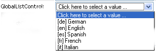
Table 5-17 Global List Properties
|
Property Name |
Description |
|---|---|
|
|
Specifies the unique identifier of the global list. This must correspond to the key specified in the directory abstraction layer. |
|
|
Apply an HTML style attribute to the field body. Example: padding-top:5px;background-color:red |
|
|
Apply one or more CSS class styles to the field body. You can view the classes that are available for your User Application portal by logging into the User Application, navigating to , then clicking the button for the portal theme you are using. If you leave the field blank, it defaults to the nv-fontExtraSmall class. Example: nv-fontMedium nv-backgroundColor3 Separate class names with spaces. |
|
|
Apply an HTML style attribute to the field label. Example: color:red |
|
|
Apply one or more CSS class styles to the field label. You can view the classes that are available for your User Application portal by logging into the User Application, navigating to , then clicking the button for the portal theme you are using. If you leave the field blank, it defaults to the nv-formFieldLabel class. Example: nv-color5 Separate class names with spaces. |
For more information about global lists, see Section 3.3, Working with Lists.
5.5.14 Localized Label
Use this control if you want to allow the user to provide translated text for the field. This control displays the standard icon that indicates the text can be localized.
Figure 5-13 LocalizedLabel Control

If the user clicks the icon, they are able to type the text for each language supported by the User Application driver. The list of languages displayed for this control is determined by the contents of the locale resource group called base-resgrp.
Figure 5-14 LocalizedLabel Control
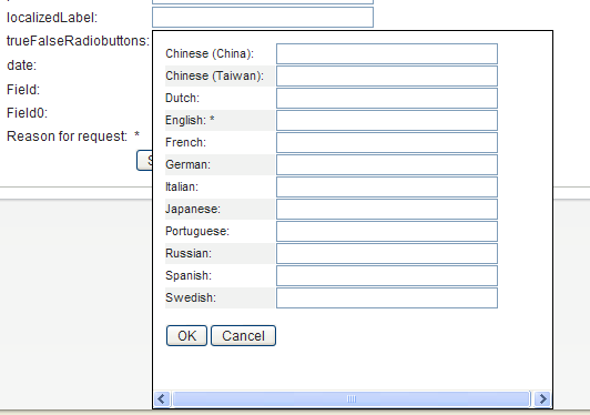
Table 5-18 LocalizedLabel Control Properties
|
Property Name |
Description |
|---|---|
|
|
Apply one or more CSS class styles to the field body. You can view the classes that are available for your User Application portal by logging into the User Application, navigating to , then clicking the button for the portal theme you are using. If you leave the field blank, it defaults to the nv-fontExtraSmall class. Example: nv-fontMedium nv-backgroundColor3 Separate class names with spaces. |
|
|
Apply one or more CSS class styles to the field label. You can view the classes that are available for your User Application portal by logging into the User Application, navigating to then clicking the button for the portal theme you are using. If you leave the field blank, it defaults to the nv-formFieldLabel class. Example: nv-color5 Separate class names with spaces. |
5.5.16 MVCheckbox
Use this control to display a set of labeled check boxes. You specify the label and its associated values through the List item property. A sample MVCheckbox control is shown below.
Figure 5-15 Sample MVCheckbox Control

Table 5-20 MVCheckbox Control Properties
|
Property Name |
Description |
|---|---|
|
|
Apply an HTML style attribute to the field body. Example: padding-top:5px;background-color:red |
|
|
Apply one or more CSS class styles to the field body. You can view the classes that are available for your User Application portal by logging into the User Application, navigating to , then clicking the button for the portal theme you are using. If you leave the field blank, it defaults to the nv-fontExtraSmall class. Example: nv-fontMedium nv-backgroundColor3 Separate class names with spaces. |
|
|
Apply an HTML style attribute to the field label. Example: color:red |
|
|
Apply one or more CSS class styles to the field label. You can view the classes that are available for your User Application portal by logging into the User Application, navigating to , then clicking the button for the portal theme you are using. If you leave the field blank, it defaults to the nv-formFieldLabel class. Example: nv-color5 Separate class names with spaces. |
|
|
Allows you to define a set of static values that comprise the check box labels and values. Click the button to launch the list value dialog box shown here: 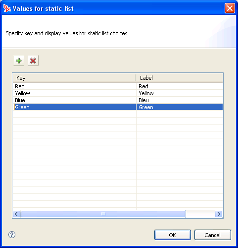
|
HINT:To retrieve user-entered values for this control, use flowdata.getObject() and not flowdata.get(). If you use flowdata.get(), you get only the first value.
For more information on preselecting values, see the Section 9.2.3, Form Control Examples.
5.5.17 MVEditor
Use this control to allow users to display, edit, or add multiple values in a drop-down list box. You can load the data dynamically from the Identity Vault, or allow users to enter the values.
The control’s appearance varies depending on the data type of the control and the properties that you specify. For example, if the data type is a DN, you can set properties that display specific attributes related to the DN. You can also enable an object selector button that allows users to search and select values by setting the Entity key for DN expression lookup property.
There are also properties that let you specify a DAL Global Query to execute or specify a root DN to drive the object picker.
Table 5-21 MVEditor with Object Selector Properties Set Control Buttons
|
Button |
Description |
|---|---|
|
|
Launches a search dialog box called an object selector. The object selector dialog box looks like this: 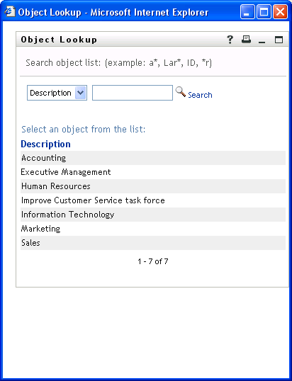
The user can select a value from the list to populate the control. The attribute displayed in the drop-down list ( in the above example) is specified in the directory abstraction layer. You specify it in the attribute’s UIControl property. See Attribute UI Control Properties. The availability of this button is controlled by the Show object selector property. |
|
|
Allows users to view the history of objects that they have searched. They can select from this list or clear its contents. The availability of this button is controlled by the Show object history button property. |
|
|
. Deletes the field contents. The availability of this button is controlled by the Show clear button property. |
If you do not set the object lookup properties, the MVEditor displays a simple edit control.
Figure 5-16 Sample MVEditor without Object Lookup Properties Set

Table 5-22 MVEditor Control Buttons
|
Button |
Description |
|---|---|

|
Adds an item to the end of the list. |

|
Deletes the selected list item. |

|
Edits the selected list item. |
HINT:When the MVEditor control’s Editable property is set to False, this control is read-only and the form does not display any MVEditor control buttons.
Table 5-23 MVEditor Control Properties
|
Property Name |
Description |
|---|---|
|
|
When this option is set to True and there is a single row of data (and the data is not a DN), the control displays a data entry text field. The text field is displayed when the field is empty or contains only one value. Otherwise, the drop-down list is displayed. If more than one row of data exists, then the drop-down list always displays. |
|
|
Specify this value if you want the control populated by the results of the Global Query that you specify. You specify the key name. You can select it from the Event Action Expression Builder. For more information about using queries in forms, see Section 5.7, Using DAL Queries in Forms. For information about defining queries, see Section 3.4, Working with Queries. |
|
|
Specifies the value for the query parameters. For example, this passes the String Sales to the queries parameter called groupname. (function (){return {"groupname":"Sales"}})(); |
|
|
Leave this value blank if you want to display the full DN or CN value. If you want to mask the DN or CN by displaying attributes instead, launch the Expression Builder and select the desired attributes from the list. (You must first specify an .) For example, to show the user entity’s first and last name attributes, construct an expression like this: FirstName LastName. Make sure the attribute’s View, Read, Search, and Required properties are set to True in the directory abstraction layer. See Section 3.7.2, Attribute Properties. |
|
|
Forces user-entered list items to be unique. |
|
|
Leave this value blank if you want to display the full DN or CN value retrieved from the Identity Vault. If you want to mask the DN or CN by displaying attributes instead, choose the entity from the drop-down list and specify a set of attributes in the Display expression property. The entity you choose must
See Section 5.6, Working with Distinguished Names for more information. |
|
|
Apply an HTML style attribute to the field body. Example: padding-top:5px;background-color:red |
|
|
Apply one or more CSS class styles to the field body. You can view the classes that are available for your User Application portal by logging into the User Application, navigating to , then clicking the button for the portal theme you are using. If you leave the field blank, it defaults to the nv-fontExtraSmall class. Example: nv-fontMedium nv-backgroundColor3 Separate class names with spaces. |
|
|
Apply an HTML style attribute to the field label. Example: color:red |
|
|
Apply one or more CSS class styles to the field label. You can view the classes that are available for your User Application portal by logging into the User Application, navigating to , then clicking the button for the portal theme you are using. If you leave the field blank, it defaults to the nv-formFieldLabel class. Example: nv-color5 Separate class names with spaces. |
|
|
Use this field to configure the field’s visible width on the form. The default is 200 pixels. |
|
|
If this option is set to True, ignore case when enforcing uniqueness. |
|
|
Minimum integer or decimal value. |
|
|
Maximum number of characters for string values. The control blocks input when this value is reached. |
|
|
Minimum number of characters for string values. The control validates that the user enters at least this number of characters. |
|
|
The number of lines displayed by the control. This is not the number of records retrieved or displayed, but the vertical size of the control. If you set this number to 10 and there are only 5 records to display, the control size is still 10 lines. You can set the number of lines to 1 or to 3 or greater. You cannot set it to 2 because it does not leave enough space for the browser to display scroll bars. If you set it to 2, Designer generates a warning in the Project Checker view and resets it to 3. NOTE:When displaying large result sets in a multivalued control, different browsers render controls at different speeds. We recommend limiting the number of lines displayed in a control to a maximum of 150 lines. |
|
|
If this option is set to True, only numbers can be entered. |
|
|
Determines whether the object selector dialog box performs an Object Lookup or a Container Lookup. The following is an example of an Object Lookup: 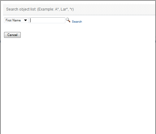
: Causes the object selector dialog box to perform an object lookup. You specify the lookup criteria via the Entity key for DN expression lookup property. : Causes the object selector to display one or more containers for selection. The containers for searching are determined by the Search container property, which is specified in the directory abstraction layer for the entity named in the Entity key for DN expression lookup property. For example, if the Entity key for DN expression lookup property is Group, the search container is set to %group-root% by default. If no search container is used, the search root specified during the User Application installation is used. |
|
|
When set to False, the DN is displayed rather than the Display expression. Consider using this when you expect a large number of DNs to be returned, and you are concerned about performance. |
|
|
Specify a root container for lookups when users click the object selector button. If you specify an entity key and a root container, the entity key takes precedence. |
|
|
When this option is set to True, displays the button next to the control. |
|
|
When this option is set to True, displays the button next to the control. |
|
|
When this option is set to True, sorts the results in ascending order. For details, see Sort Order. |
|
|
The maximum numeric value users can enter. |
HINT:To retrieve user-entered values for this control, use flowdata.getObject() and not flowdata.get(). If you use flowdata.get(), you get only the first value.
For more information about preselecting items, see Section 9.0, Working with ECMA Expressions.
5.5.19 PickList
Use the PickList control to allow users to view and choose one or more values from a dynamically generated list of choices. The list items are DN or CN values retrieved from the Identity Vault. You can display the full DN or CN or use the PickList properties to specify the attributes to display instead.
Figure 5-17 Sample PickList Control without DN Masking

Figure 5-18 Sample PickList Control with DN Masking

Table 5-25 PickList Control Properties
|
Property Name |
Description |
|---|---|
|
|
When this option is set to True, the user can select more than one list value using their platform-specific multi-select keys. When this option is set to True, the control displays a minimum of three lines regardless of the value specified in the Number of lines displayed property. If this value is False, the Number of lines displayed property is used. |
|
|
Leave this value blank if you want to display the full DN or CN value. If you want to format the DN or CN by displaying attributes instead, launch the Expression Builder and select the desired attributes from the list. (You must first specify an .) For example, to show the user entity’s first and last name attributes, construct an expression like this: FirstName LastName. Make sure the attribute’s View, Read, Search, and Required properties are set to True in the directory abstraction layer. See Section 3.7.2, Attribute Properties. |
|
|
Leave this value blank if you want to display the full DN or CN value retrieved from the Identity Vault. If you want to mask the DN or CN by displaying attributes instead, choose the entity from the drop-down list and specify a set of attributes in the Display expression property. The entity you choose must:
|
|
|
Apply an HTML style attribute to the field body. Example: padding-top:5px;background-color:red |
|
|
Apply one or more CSS class styles to the field body. You can view the classes that are available for your User Application portal by logging into the User Application, navigating to , then clicking the button for the portal theme you are using. If you leave the field blank, it defaults to the nv-fontExtraSmall class. Example: nv-fontMedium nv-backgroundColor3 Separate class names with spaces. |
|
|
Use this field to configure the field’s visible width on the form. The default is 200 pixels. |
|
|
Apply an HTML style attribute to the field label. Example: color:red |
|
|
Apply one or more CSS class styles to the field label. You can view the classes that are available for your User Application portal by logging into the User Application, navigating to , then clicking the button for the portal theme you are using. If you leave the field blank, it defaults to the nv-formFieldLabel class. Example: nv-color5 Separate class names with spaces. |
|
|
The number of lines displayed by the control. This is not the number of records retrieved or displayed, but the vertical size of the control. If you set this number to 10 and there are only 5 records to display, the control size is still 10 lines. The number of lines displayed is related to the Allow multiple selections setting. When Allow multiple selections is set to True, the number of lines displayed is always 3 (or more). When Allow multiple selections is set to False, you can set the number of lines to 1 or to 3 or greater. You cannot set it to 2 because it does not leave enough space for the browser to display scroll bars. If you set it to 2, Designer generates a warning in the Project Checker view and resets it to 3. NOTE:When displaying large result sets in a multivalued control, different browsers render controls at different speeds. We recommend limiting the number of lines displayed in a control to a maximum of 150 lines. |
|
|
When this option is set to True, two lists are displayed. A list on the left displays the unselected values, and the list on the right displays the selected values. The Allow multiple selections property must be set to True. If set to false is ignored. |
|
|
When this option is set to True, sorts results in ascending order. For details, see Sort Order. |
HINT:To retrieve user-entered values for this control, use flowdata.getObject() and not flowdata.get(). If you use flowdata.get(), you get only the first value.
For more information on displaying the control with a preselected option, see Section 9.2.3, Form Control Examples.
5.5.21 Static List
Use this control to display a list of items in a drop-down list from which users can select a single item. The list items are static and are stored with the provisioning request definition. The text “Click here to select” only appears if the field is not set to Required.
Figure 5-19 Sample Static List Control
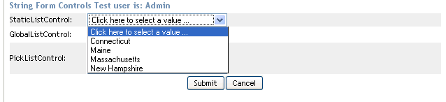
Table 5-27 Static List Properties
|
Property Name |
Description |
|---|---|
|
|
Allows you to configure the form to automatically select the first value in the static list. You can select , , or . If you select only if required is true, the form only automatically selects the first value in the list if the value of the default property is . |
|
|
Apply an HTML style attribute to the field body. Example: padding-top:5px;background-color:red |
|
|
Apply one or more CSS class styles to the field body. You can view the classes that are available for your User Application portal by logging into the User Application, navigating to , then clicking the button for the portal theme you are using. If you leave the field blank, it defaults to the nv-fontExtraSmall class. Example: nv-fontMedium nv-backgroundColor3 Separate class names with spaces. |
|
|
Use this field to configure the field’s visible width on the form. The default is 200 pixels. |
|
|
Apply an HTML style attribute to the field label. Example: color:red |
|
|
Apply one or more CSS class styles to the field label. You can view the classes that are available for your User Application portal by logging into the User Application, navigating to , then clicking the button for the portal theme you are using. If you leave the field blank, it defaults to the nv-formFieldLabel class. Example: nv-color5 Separate class names with spaces. |
|
|
Allows you to define a set of labels and values that comprise the static list. Click the button to launch the list value dialog box shown here:
Click to add list items. Each list item must have a unique key. The dialog box automatically generates a unique key when you insert a new list item. You can click the key name and change it. A blank key (null) is valid, so it is possible to have a list item with a blank key and a blank label. The displayed label is the one defined for the default language. |
5.5.22 Text
Use the Text control for data display or user input. User input is validated depending on the control’s data type.
Figure 5-20 Sample Text Control

Table 5-28 Text Control Properties
|
Property Name |
Description |
|---|---|
|
|
Apply an HTML style attribute to the field body. Example: padding-top:5px;background-color:red |
|
|
Apply one or more CSS class styles to the field body. You can view the classes that are available for your User Application portal by logging into the User Application, navigating to , then clicking the button for the portal theme you are using. If you leave the field blank, it defaults to the nv-fontExtraSmall class. Example: nv-fontMedium nv-backgroundColor3 Separate class names with spaces. |
|
|
Use this field to configure the field’s visible width on the form. The default is 200 pixels. |
|
|
Apply an HTML style attribute to the field label. Example: color:red |
|
|
Apply one or more CSS class styles to the field label. You can view the classes that are available for your User Application portal by logging into the User Application, navigating to , then clicking the button for the portal theme you are using. If you leave the field blank, it defaults to the nv-formFieldLabel class. Example: nv-color5 Separate class names with spaces. |
|
|
The lowest number allowed for decimal or integer values. |
|
|
The maximum length for string values. Blocks input when this length is reached. |
|
|
The minimum length for string values. Validates that the user enters a string at least this long. |
|
|
Specifies the number of characters a user is allowed to enter. This is related to Field width in pixels. |
|
|
The highest number allowed for decimal or integer values. |
|
|
An expression used for validating the field’s data. Designer provides a default set of validation masks by default. You must enable them through . For more information, see Section 2.3, Setting Provisioning View Preferences. |
5.5.23 Text Area
Use this control to display or accept input of multi-line data. Users can select multiple lines of data using the multi-select key combination for their platform.
Figure 5-21 Sample Text Area Control
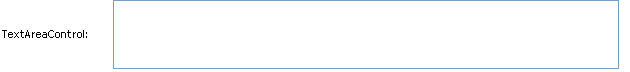
Table 5-29 Text Area Control Properties
|
Property Name |
Description |
|---|---|
|
|
Apply an HTML style attribute to the field body. Example: padding-top:5px;background-color:red |
|
|
Apply one or more CSS class styles to the field body. You can view the classes that are available for your User Application portal by logging into the User Application, navigating to , then clicking the button for the portal theme you are using. If you leave the field blank, it defaults to the nv-fontExtraSmall class. Example: nv-fontMedium nv-backgroundColor3 Separate class names with spaces. |
|
|
Apply an HTML style attribute to the field label. Example: color:red |
|
|
Apply one or more CSS class styles to the field label. You can view the classes that are available for your User Application portal by logging into the User Application, navigating to , then clicking the button for the portal theme you are using. If you leave the field blank, it defaults to the nv-formFieldLabel class. Example: nv-color5 Separate class names with spaces. |
|
|
The visible width of the control; the number of characters wide. |
|
|
The number of lines to display at one time. |
5.5.26 TrueFalseRadioButtons
Use this control to display a choice of True or False as a set of radio buttons.
Figure 5-22 Sample TrueFalseRadioButtons Control

This control has no custom properties.
NOTE:This control returns a Boolean value of True or False depending on the selection made by the user. The display values of the control can be set to a more user friendly or informative value such as Yes/No or Accept/Reject depending on the intended use of the form; however, the underlying value always returns either True or False. If the control is used to return anything other than True or False or more than two values, for example (Yes/No/Maybe), by default it returns the value as False if it is not True.
5.5.27 TrueFalseSelectBox
Use this control to display a choice of True or False in a drop-down list.
Figure 5-23 Sample TrueFalseSelectBox Control
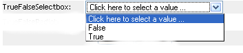
NOTE:This control returns a Boolean value of True or False depending on the selection made by the user. The display values of the control can be set to a more user friendly or informative value such as Yes/No or Accept/Reject depending on the intended use of the form; however, the underlying value always returns either True or False. If the control is used to return anything other than True or False or more than two values, for example (Yes/No/Maybe), by default it returns the value as False if it is not True.
Table 5-32 TrueFalsSelectBox Properties
|
Property Name |
Description |
|---|---|
|
|
Use this field to configure the field’s visible width on the form. The default is 200 pixels. |