7.3 Understanding the Dashboard Interface
The dashboard displays the analysis of the data.
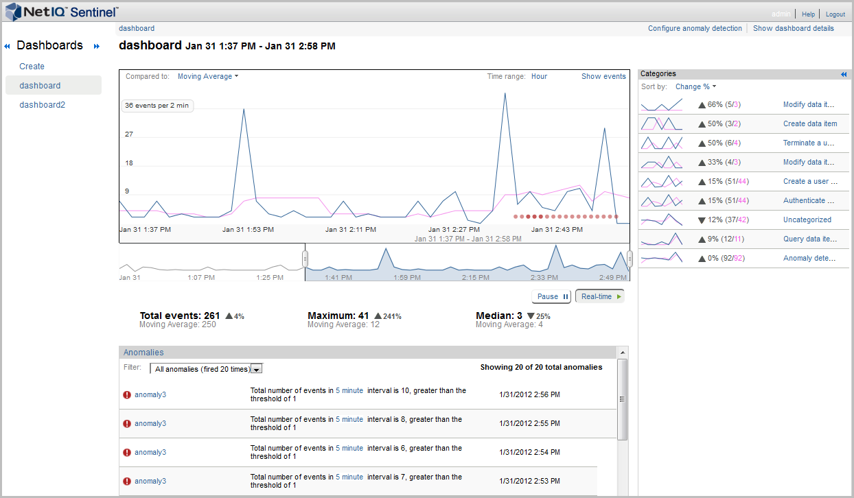
Chart: The graph displays the events, the anomalies, and the baseline.
Compared to: Displays the types of baselines for comparison with the flowing data. Baseline is the referenced line that is displayed in blue color, whereas the actual events that are flowing in to the system is displayed in brown. You can compare the flowing data to the following:
-
Moving Average: Data that is flowing in to the system is compared to the average of the data.
-
Previous Day: If you have one day data stored in Security Intelligence database (MongoDB), then you can compare the flowing data with the previous day data.
-
Previous Week: If you have one week of data stored in Security Intelligence database (MongoDB), then you can compare the flowing data with the previous week data.
-
Create Baseline: Allows you to create a custom baseline You must have at least a week’s worth of data before you can create a baseline. For more information on creating a custom baseline, see Creating Baselines.
Time range: Displays the time range between which we can see the data. When you create a dashboard, the Time range shows . It then displays and as you have one day or one week data stored in Security Intelligence database (MongoDB). The Hour option does not appear, if the Security Intelligence database (MongoDB) have 28 days of data.
Show Events: Displays the list of events for the selected time range in the Sentinel Main interface. The total events in the Sentinel Main interface matches with the total events in the dashboard. However, the total events count in the Sentinel Main interface does not match with the total events in the dashboard in the following cases:
-
If the leftmost and rightmost time point on the dashboard are included. To match the events in the dashboard and Sentinel Main interface, select the time point between the leftmost and rightmost time point on the dashboard.
-
By default, Sentinel includes internal audit events in the dashboard search results. To exclude the internal events, create a dashboard by using the filter (sev:[0 TO 5]) -st:A -st:I -st:Y. For more information, see Creating a Dashboard by Using a Filter.
Time Slider: The time slider allows you to change the amount of information displayed in the dashboard. It allows you to zoom in or zoom out for a specific time period. As you move the time slider, the graph changes accordingly.
Time Slider Data Summaries: Below the graph, a summary of the time slider data is displayed. The data that is
Anomalies: Displays the anomalies that have occurred during the lifetime of the dashboard. To view the details of the anomaly, you can click on anomaly name. This displays the anomaly detail page.
Categories: The panel on the right of the dashboard displays the categories of the current time range at the current level of the dashboard. It provides the ability to drill down and find more information about the categories of events. This section displays lines identifying changes from the baseline indicators of the categories. You can sort the category list by percent change, reference count or current count.
The percentage change is calculated as follows:
percent change = ((v2 - v1)/v1) x 100, where v2 is the new value and v1 is the initial value. However, if v1 (initial value) is zero, then the percentage change is calculated as percentage change = v2 x 100.
Clicking a specific category in the list on the right displays the data for just that category. It changes the main graph to show the events in that category list. The totals in the main section changes to reflect the current category. It also displays the following sections in the bottom of the main panel.
-
Category anomalies: Displays anomalies happened in the current time window for the selected category.
-
Category breakdown: Displays the attributes of the selected category. Only top 10 values of the selected category are displayed in the UI. You can click any value under the list to view the list of events in the Sentinel Main interface.
The list on the right changes to and displays attributes of the selected category. You can sort them as per your requirement.