8.14 Configuring the Starter Portlet
The element displayed on the Starter portlet is the starting element for all the portlets on the page. The Starter portlet initially shows the home element for the user.
Additional elements can be added to the Starter portlet to create a flat list of elements and their statuses. Clicking any of the elements, drives other portlets on the page.
You can select an icon to display as a status indicator for the element. The color of the icon identifies its current condition. The color is based on the colors set for condition in the Operations Center server. For more information, see Managing Condition/Severity Colors in the Operations Center 5.5 User Guide.
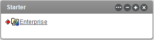
Figure 8-16 Starter Portlet
To change the starting element for all portlets on the page:
-
On the Starter portlet, Click
 and select
  .
.
-
Do the following to change the starting element, or add additional elements:
-
Click the tab, then click the tab. The current start element displays on the tab.

-
Click the ) tab.
-
Use the or tabs to locate, then select one or more elements.
-
Click .
-
Click .
-
-
Click the tab to select the status indicator icon.

-
Specify the following options:
Height: Enter the size of the portlet height in pixels. For example, enter .
Status Indicator: Select a diamond, square, oval, or arrow for the type of icon to display the current condition. Click to not display any status indicator icon.
-
Select the option to allow the Dashboard to receive automatic updates from the Operations Center server as content changes occur. Selected by default; deselect to manually control updates.
-
Click .
-